February 4, 2013, 9:13 pm
Designed by
In Mood Designers,
Greece.
Olico SA is one of the biggest collector and trader of Extra Virgin Olive Oil in Greece, as far as regards the exports, suppling the biggest European packers ( especially Italian and Spanish ), but also USA and Asian companies.
In 2012, the company approached In Mood Designers to design their own label, under the brand Olico, for a premium extra virgin olive oil selected with passion by Olico's experts from the most famous olive farms in Greece. 100% Hellenic Olive Oil!
![]()
↧
February 4, 2013, 9:40 pm
↧
↧
February 5, 2013, 1:36 am
![]()
Designed by
Todd Anderson,
South Africa.
Each fragrance of hand and nail cream in the Touch range uses strong imagery to tell its own design story. Tight architecture and a constant colour palette then act as a framework to maintain continuity on shelf. Metal effect 60ml tubes stood up in a specifically designed Point of Sale unit further add to its unique shelf appeal, and three tubes packaged together make it a stunning instant gift.
![]()
↧
February 5, 2013, 3:12 am
Designed by
Milena Wlodarczyk,
Poland.
Packaging for flowers helps in a quick and convenient way to transport the flowers without prejudice to their natural structure. The project is made from one piece of corrugated cardboard, which by proper bending becomes a stable structure likely to transmit various types of flowers. Packaging can be used as outdoor advertising for florists.
![]()
↧
February 5, 2013, 3:16 am
Designed by
Michelle Wang,
United States.
This is a branding and packaging project for beer being brewed in the White House. Instead of being sold in stores, honorary guests receive this as a limited edition four-pack sampler from the President. This fictional brand is named We the People, drawing inspiration from the historic documents on which our nation is founded on. The labels on each bottle pay tribute to a different document. Similar to how these documents are displayed in the National Archives in Washington DC, the packaging is meant to be utilized as a display case.
"The President of the United States is pleased to present the official White House line of home-brewed beer. This four-pack sampler features a Honey Pilsner, Pale Ale, Brown Ale, and Honey Porter, all of which are infused with honey from our own bee-hive on the White House's South Lawn. This limited edition beer is dedicated to the four historic documents on which our nation is founded on — the Articles of Confederation, the Declaration of Independence, the Constitution, and the Bill of Rights. So here's to the people, for the people, by We The People!"
![]()
![]()
![]()
![]()
![]()
![]()
↧
↧
February 5, 2013, 3:23 am
![]()
Designed by
mousegraphics,
Greece.
Τhe brief: 'we want our high quality products to become the preferred choice for beauty concious women'.
Τhe target audience: women who are well informed and prefer not to spend on highly advertised products.
The design: what we needed to convey through the identity and packaging design of this range of products was trust and intimacy. It targets women within the very environment of beauty care and we decided to make this environment part of the design concept. Youth Lab is, by language and symbol choice, a straightforward reference to a personal laboratory, a place where each individual is treated specially and with the proper, tested materials. The retro futuristic character of the lab tube and the thin, elongated type font speaks of scientific seriousness, while the choice of fluorescent colors on rough carton paper, suggests calculated boldness and personality. The result is a product that is familiar but not boring, trustworthy but also linked with research and experimentation.
![]()
↧
February 5, 2013, 11:59 pm
Designed by
Kooroo Kooroo,
United States.
Crochet Toy Packaging
Kooroo Kooroo is an independent brand working to create matter from life with color and personality. Our idea is to create a colorfully vivid, expansive universe, rich in ideas that focus on unique, experimental expressions of human empathy. We choose to apply our talents towards providing positively enlightening experiences that seamlessly educate, entertain, stimulate, and endure. Kooroo Kooroo’s design is meant to teach as well as illustrate a tactile form of a complex idea. Our packaging serves the same philosophy, to encourage the use of fundamental principles that can be applied to life for learning, growing, and spreading good feeling. These principals we all know, but often times forget while progressing through a busy and demanding life.
Inspired by the tactile form of a loving warm embrace, the Mochie series packaging is our interpretation of a hug. With arms tightly secured and limbs closely guarding the heart, what is precious is locked away. It was important to remind others that within the simple act of a hug - sometimes simply opening up, can lead to the most invaluable rewards.
Journal Packaging
Kooroo Kooroo’s Colored Pages series marks our first creative endeavor into the world of creative, streamline, designer journals. With thoughtful packaging that wraps the content with introspective philosophy, we wanted to remind others that inspiration is undoubtedly the fruit of the earth: plentiful and high-yielding when tended and maintained. The packaging also promises a second layer of surprise, that rewards a slower contemplation.
For us, it is necessary to move away from distracting packaging and products that have no value and do not add to the quality of being. Packaging, as well as product, should have depth and appreciation for heart, crafted with specific intent to help add value to its consumers' lives or contribute to the overall quality of the human condition. We strive to apply mindful principals and thoughtful expressions of human empathy that illustrate a universal truth as an alternative to mechanical product lines.
![]()
![]()
![]()
![]()
![]()
![]()
![]()
![]()
![]()
![]()
![]()
↧
February 6, 2013, 12:05 am
Designed by
Aloof,
United Kingdom.
Aloof have designed a range of gift sets for luxury fragrance brand Neom Organics, as part of a phased repositioning of the brand.
Launched for 2013, the gift sets follow Aloof's successful refinement of the existing product and packaging range, launched nationwide in John Lewis throughout 2012. Aloof have also worked on the brand's marketing collateral including tone of voice, brochures and an e-marketing campaign. A further, significant brand/packaging phase is scheduled for launch in 2014.
![]()
↧
February 6, 2013, 12:16 am
Designed by
Luca Patkos,
Hungary.
My task was to redesign 3 package of medicine for Richter Gedeon. On one hand I wanted to make an unified design for the different medicines, to create a distinct brand. But in the other hand I had to attend not to mingle the different products within the brand. In the interest of this, I designed not just 3 types of medicine, but also all products of Richter Gedeon. Thus for the different types I assigned different colors, and differentiate the certain sorts with various illustrations.
![]()
↧
↧
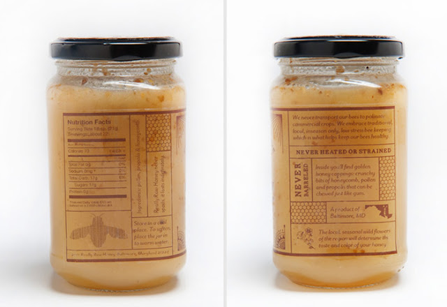
February 6, 2013, 12:22 am
Designed by
Nicole Erthein,
United States.
Really Raw Honey is a package design project aimed to improve the appearance of a product that already exists. I wanted to give the product a more natural and organic feel and make it feel more like the product it contained.
![]()
↧
February 6, 2013, 12:33 am
![]()
Designed by
Diego Decortes,
Italy.
"Torino by GNAM!" created three tea to warm up this winter 2012. We bypassed the herbal shop Melissa opening jars, sniffing and making inspired by the scents and flavors. After a long process of careful mixing (and gallons of tea for every taste) we arrived at 3 recipes that represented in our imagination "3 perfect moments."
The perfect moment is special brackets where everything fits and finishes. The color of the leaves, the softness of the scarf, that song in the headphones. The soft green chair in that space in London, the last pages of the book, the taste of butter and salt together ...
For each of these occasions, "Torino by GNAM!" have created a blend of tea:
- MOUNTAIN DREAM, Your refuge is a Ceylon tea with notes of pine and blueberries, as thought deserved to cuddle when you are alone;
- HOLD ME TIGHT, A sweet hug: This is a Darjeeling tea with notes of Orange Blossom, to share with those who warms your heart "you put on to boil water, I choose the movies to watch";
- THE COUCH SOCIETY, A time to be together: This is a ceylon tea Fruity with notes and red sorrel, ideal to be shared with your friends all comfy on the couch "who wants honey?".
This packaging is done for a simple and easy "home made in the shop".
![]()
![]()
![]()
![]()
![]()
![]()
↧
February 6, 2013, 12:38 am
![]()
Designed by Vasiliki Filippopoulou,
Greece.
![]()
↧
February 6, 2013, 12:46 am
Designed by
Marios Karystios and
George Tzavaras,
Greece.
Thoukis distillery has its roots back in 1929 in Cyprus, concentrating in the production and trading of fine local spirits amongst which the classic Greek/Mediterranean Ouzo liqueur. This Limited Edition Ouzo particularly reflects an old restorative formula with a proprietary blend of herbs and botanicals in high-proof alcohol and redistilled in a combination pot and column still to deliver the original 1929 formula “true-to-botanicals experience” of Thoukis Kiprianou, founder and master distiller. The label depicts the main ingredient , the anise plant (pimpinella anisum)of this unique aromatic spirit in an elegant way.
![]()
↧
↧
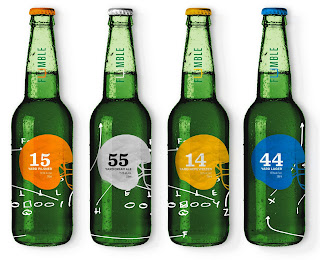
February 6, 2013, 1:05 am
![]()
Designed by
Stefan Rauch,
Canada.
School: Art Institute of Vancouver
Fumble Brewing Co. has a distinctive collection of beers. All contain an unusually high alcohol content compared to other products on the market.
![]()
↧
February 6, 2013, 1:10 am
![]()
Designed by
Flowart Agencia Creativa,
Spain.
New packaging design for this company located in Sevilla (Spain), all its product are made in hand since 1969, specially oil cakes typically Spanish.
![]()
↧
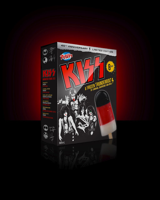
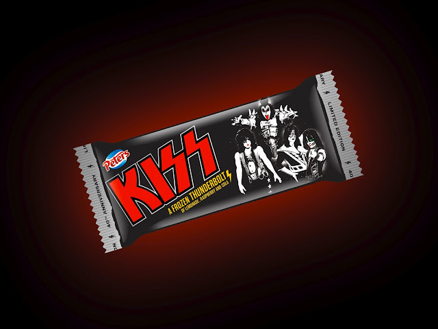
February 7, 2013, 2:19 am
Designed by
Studio Minieri,
Australia.
Illustration: Domenic Minieri
Iconic Australian brand, Peters Ice Cream, has joined forces with legendary rock giants KISS to make their upcoming Monster Tour even sweeter by bringing back the famous Peters KISS ‘Thunderbolt’ ice block.
Studio Minieri was tasked with creating the look for the new packaging, advertising and point of sale material, which takes cues from the original 1980's packaging and will be rolled out nation wide in February 2013.
![]()
↧
February 7, 2013, 2:27 am
Designed by
Ampro Design
Country:
Romania
Creative director: Irinel Ionescu
Senior designer: Francesca Muresan
Account Manager: Mihaela Dumitrescu
Illustrator: Alin Patru
Prepress: Danubiu Birzu, Gabi Costea.
Morarita is the first brand of the company Panovia prod - both historically and as sales volume. Morarita was always positioned (packaging design, product, price) as a popular brand, easy traditionalist to meet the basic needs of housewives. Morarita was a very successful brand with one strong competitor (Linco) and many local players. In the last 3 years Morarita was constantly losing market share reaching before the redesign a 10% market share in the frozen “basic” category.
THE BRIEF:
Current situation: Currently, the biggest problem is the lack of visibility of the brand on the shelves; our product is lost among the competition. Also, the current packaging looks “dusty”.
Why do we need new design?
- The main problem is lack of visibility on shelf
- Market shares currently allows a much stronger change (a revolution and not evolution
this time) because the risk is much lower.
Objectives:
- Redrawing the entire “Morarita” range (based on a concept).
- Increase shelf visibility and ease of identification by the consumer brand
- Regaining confidence in the brand.
THE SOLUTION:
1. To stand out on shelf and to have good visibility, we chose white as the brand color;
2. After analyzing the existing packaging, we’ve realized that there is a gap between
the naming, Morarita (the woman from the mill, the Miller) and the look and feel of
the pack. To connect visual brand positioning, we redesigned the logo and have included
the milling woman face into the logo;
- As a brand signal, we used embroidered flowers (in a traditional Romanian style) to
give authenticity and human touch to the packages, also offering packages femininity.
THE RESULTS:
The product gain visibility in shelf, also managing to build a very good shelf block;
The packaging was awarded in Pentawards competition.
The sales increased by 12% in 6 months without any communication activity.
The Modern trade buyers had a very good reaction and they wanted to have the new packaging in shelf.
![]()
![]()
![]()
![]()
![]()
↧
↧
February 7, 2013, 2:33 am
Designed by
Dóra Novotny,
Hungary.
This work was made for a university task, where they asked to create package designs for 3 different diseases:
• VITALIA OCULO PLUS - eye disease
• CARIPRAZINE - nervous system disease
• CURIOSIN - skin disease
My aim was to create a fresh, clean and understandable design. I picked the central organs of the diseases, and made an illustration of them. My concept is based on these illustrations, which are round shaped. They would be silver foiled, by this it gets an elegant, clean impression. In each box, on the front and on the back, the half of the illustrations appeares, so if you put them next to each other, you get the full figures. If you do this with different boxes, you also get the entire drawing. The bottles' labels are designed under the same concept.
![]()
↧
February 7, 2013, 2:55 am
Designed by
Stelios Pseftogas of noon design,
Greece.
Packaging for the seasoning blends brand "Kali Nikokira".
Kali Nikokira seasoning blending products contain a mixture of herbs, spices and salt for a variety of different food categories like pasta, poultry, fish etc.
Enriching the taste of the food and highlighting its aromatic character, "Kali nikokira" blends make cooking easy.
![]()
↧
February 7, 2013, 8:56 pm
![]()
Agency:
Publicis Slovenia
Country:
Slovenia
Designer: Petja Montanez
Photography: Pablo Montanez
Make up artist: Alja Sušnik
Album - Scent of love is work of chansonnier Romana Krajnčan. We Promote her album and the way That we merge two goods - Compact Disc & perfumes DKNY Be Delicious. The booklet had Scent of love smell (perfume DKNY Be Delicious).
![]()
↧