↧
Everyday Hero (Student Project)


↧
British Bulldog Pub

Designed by Ideamo branding & design, Poland.
There is a place, in the very heart of Warsaw, where lovers of excellent British drinks, connoisseurs of juicy steaks and sport supporters meet – in the British Bulldog Pub you can feel the atmosphere of a British pub at its best.
The restaurant has been present on the capital’s culinary map for many years and is valued by regular visitors. In 2012 the owners decided to freshen it up.
The beautiful new interiors required new graphic design. It was also decided to change the name. That is how the London Steak House became the British Bulldog Pub and we were granted the honor of creating the new visual identification.
The new logo was to be strong and manly like a seal. We have decided to juxtapose black and white, without any additional colors. The applied font could be successfully used for a beer brand – the beverage of which the pub is a sanctuary. And, of course, the English Bulldog – the breed present on the British Isles for more than a thousand years, one of the symbols of the
United Kingdom. The most famous of them is undoubtedly Rufus – Winston Churchill’s dog. And that is why it became part of our logo and the mascot
of the Pub.
The British Bulldog Pub reopened and the first spectacular tests for both the owners and ourselves were the European Football Championship EURO 2012 and the subsequent game between Poland and England at the national stadium. Guess which place was the most popular with the English fans?...


↧
↧
Willie’s Cacao Luxury Desserts Range


Designed by BrandOpus, United Kingdom.
BrandOpus rustles up luxury desserts range for Willie’s Cacao
Willie’s Cacao, the only premium chocolate maker in the UK making chocolate from ‘bean to bar’, has launched a range of three indulgent desserts set to reframe the chilled dessert category. The brand design has been created by long-term agency partner, BrandOpus.
The man behind the brand, Willie Harcourt-Cooze, has travelled the world on a quest for the world’s great and unique cacaos, and accordingly each dessert has its own astonishingly individual taste. These decadent treats take the consumer on a voyage of discovery, much like Willie’s own discovery of the world of cacao, as they experience amazing combinations of flavours, textures and the highest quality cacao.
BrandOpus have created a design that evokes the unique flavour experience of each dessert. Filigree adorns the type, whilst touches of punchy colour differentiate the three products, represent the amazing combinations of flavours and textures, and creating on shelf standout.
Each of the three desserts have been formulated by Willie himself to create a truly indulgent, decadent and sensory experience, and the names of the products: Molten Dreams, Paradise Found, Heaven’s Gates, have been chosen to reflect the journey of flavours and element of discovery and adventure behind the product.
The range of desserts builds on the award winning partnership between BrandOpus and Willie’s Cacao. BrandOpus previously designed the identity and brand architecture across the portfolio. Available now from selected Waitrose supermarkets.
↧
Cookie Break (Student Project)

Designed by Tatiana Rusalovskaya, Artem Maslov, Alya Lugovaya and Stas Semin
3D modelling – Vladimir Pospelov
Country: Russia
Packaging for a new line of organic products.
It is a healthy complex snack-set: cookies, natural yogurt and homemade jam (kiwi, cherry or orange). All ingredients are organic and VERY fresh.
Three cardboard tubes are placed on top of each other inside of a shrink-wrapped container. All brand information is printed on the wrapper. The tubes contain only a photo of the content and a description of the product.
When the customer is removing the wrapper, he/she is metaphorically getting free from the chains of the urban hustle and haste and is left alone with the product.
Target audience: well-off people who live in big cities and care about what they eat.


↧
Aleing Authors Craft Beer Series (Student Project)


Designed by Stephanie Sabo, United States.
Aleing Authors is a a unique assortment of craft beers inspired by influential authors of the 19th and 20th centuries. Subtle references to the six authors are incorporated on each bottle. The beer name and ingredients relate to each author as well as their literary works. To flesh out the beer's identity, famous quotes and iconic imagery from their novels are incorporated on the front label, so the beer tells the story itself.
The connection between an author's escalating success and troubled life is explored through these beers. Aleing Authors simultaneously references the beer culture and the struggles of these famous authors. The six authors chosen all embody this archetype, Virginia Woolf, F. Scott Fitzgerald, Ernest Hemingway, Mary Shelley, Oscar Wilde, and Edgar Allen Poe.
Incorporated are aesthetic styles from the time period of the authors. Design from the 19th and 20th centuries is explored, especially through the ornate typography and decorative Victorian-esque borders on the bottles.
The portraits were created in illustrator from iconic photographs. One major concern was balancing the old with the new. It was important to retain a nostalgic feel, yet remain approachable to a contemporary audience. The portraits bridge this gap through their illustrative style custom to graphic novels while energizing these long dead authors and priming them for a 21st century audience. The portraits work to attract new eyes unfamiliar with the authors and their works but drawn to their illustrative style.
The six-pack crate was ordered on Etsy and designed by Timothy Giles. The wood arrived laser-cut and disassembled, which was then constructed and the Old Inkwell logo stamped below the handle. The case allows clear display of the labels while the wood compliments the antique hand-made style of the craft beer. Ideally, customers could reuse this case, returning to the brewery for refills at a discounted price.


↧
↧
Winking Cottage Pinot Noir Concept

Designed by Eric Krueger, United States.
Labels for my small batch, home winery. Because these labels were for such a small edition (31 bottles), I thought it would be interesting to come up with something that wouldn't be easily replicated commercially and to explore the shape of the bottle further with a label that wraps around it. Each label is individually torn and numbered and because these are for personal consumption and not for sale I was able to take the liberty of skipping some of the standard information required on US wine labels.
Winking Cottage is the name an Aunt gave the house my wife and I live in, seeing that it has only one dormer on one side of the house (instead of a single dormer in the middle or two dormers).


↧
The Disappearing Package - Tide PODs
A Masters Thesis Project by Pratt Institute student Aaron Mickelson.
Every year, we throw away a ton of packaging waste (actually, over 70 million tons). It makes up the single largest percentage of trash in our landfills (beating out industrial waste, electronics, food… everything). Figures released by the EPA indicate this problem is getting worse every year.
As a package designer (and grad student—meaning I know everything and can solve every problem, naturally), I was concerned about where this trend is going. Of course, many talented designers working in the field have made great efforts over the past few years to reduce the amount of packaging that goes onto a product. However, for my Masters Thesis, I asked the question: Can we eliminate that waste entirely?
The package itself is a sheet of laundry pods stitched together, printed using soap-soluble ink. The POD plastic is, just like in the existing product, water-soluble. Consumers tear off each POD and use one-by-one. With the last POD, the package itself is gone.
![]()
EXISTING PACKAGING
The primary packaging is a flexible plastic bag that, while product remains, serves as re-usable container. However, it becomes totally worthless when empty and will be tossed.
![]()
DISAPPEARING SOLUTION
PODs, instead of being stored loose, are stitched together into a perforated sheet. Product details and brand information are then printed directly onto this sheet. All inks are water-soluble, and dissolve in the wash (just like soap dyes).
![]()
![]()
THE METHOD
The customer tears off PODs one-at-a-time as needed, simply tossing the POD directly into the wash. All parts of the packaging dissolve safely. When the last POD has been used, the package is gone. No waste to throw away.
![]()
![]()
INSIGNIA
Every solution features an insignia that both identifies it as a Disappearing Package (building brand recognition) and clearly instructs the consumer on how to disappear it.
![]()
![]()
![]()
![]()
![]()
![]()
![]()
Every year, we throw away a ton of packaging waste (actually, over 70 million tons). It makes up the single largest percentage of trash in our landfills (beating out industrial waste, electronics, food… everything). Figures released by the EPA indicate this problem is getting worse every year.
As a package designer (and grad student—meaning I know everything and can solve every problem, naturally), I was concerned about where this trend is going. Of course, many talented designers working in the field have made great efforts over the past few years to reduce the amount of packaging that goes onto a product. However, for my Masters Thesis, I asked the question: Can we eliminate that waste entirely?
The Disappearing Package - Tide PODs
The package itself is a sheet of laundry pods stitched together, printed using soap-soluble ink. The POD plastic is, just like in the existing product, water-soluble. Consumers tear off each POD and use one-by-one. With the last POD, the package itself is gone.

EXISTING PACKAGING
The primary packaging is a flexible plastic bag that, while product remains, serves as re-usable container. However, it becomes totally worthless when empty and will be tossed.

DISAPPEARING SOLUTION
PODs, instead of being stored loose, are stitched together into a perforated sheet. Product details and brand information are then printed directly onto this sheet. All inks are water-soluble, and dissolve in the wash (just like soap dyes).


THE METHOD
The customer tears off PODs one-at-a-time as needed, simply tossing the POD directly into the wash. All parts of the packaging dissolve safely. When the last POD has been used, the package is gone. No waste to throw away.


INSIGNIA
Every solution features an insignia that both identifies it as a Disappearing Package (building brand recognition) and clearly instructs the consumer on how to disappear it.

↧
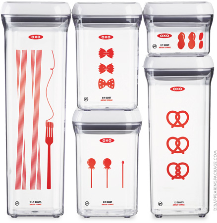
The Disappearing Package - OXO POP Containers
A Masters Thesis Project by Pratt Institute student Aaron Mickelson.
Every year, we throw away a ton of packaging waste (actually, over 70 million tons). It makes up the single largest percentage of trash in our landfills (beating out industrial waste, electronics, food… everything). Figures released by the EPA indicate this problem is getting worse every year.
As a package designer (and grad student—meaning I know everything and can solve every problem, naturally), I was concerned about where this trend is going. Of course, many talented designers working in the field have made great efforts over the past few years to reduce the amount of packaging that goes onto a product. However, for my Masters Thesis, I asked the question: Can we eliminate that waste entirely?
Brand identity, marketing material and product details are all screen-printed directly on to the surface of the container with soap-soluble inks. Everyone washes food containers before use; that same act now disappears the package.
![]()
EXISTING PACKAGING
Currently, brand identity and marketing material are printed on a glossy paper slip held inside the container. Immediately, this printed material is thrown away, as it cannot possibly serve any further purpose to the consumer.
![]()
DISAPPEARING SOLUTION
The same information—OXO’s brand mark, the product name and details, and a depiction of what might be stored inside—is printed directly on the surface of the container. In deference to this printing technique, all graphics and text are solid, single colors.
![]()
![]()
THE METHOD
The ink used is not water-soluble, but soap-soluble, so it washes away with soapy water. Because this product is used for food storage, it’s likely the consumer would wash it first anyway. In this process, the “label” breaks down completely and is safe both for the environment and for septic.
![]()
INSIGNIA
Every solution features an insignia that both identifies it as a Disappearing Package (building brand recognition) and clearly instructs the consumer on how to disappear it.
![]()
![]()
![]()
![]()
![]()
![]()
![]()
Every year, we throw away a ton of packaging waste (actually, over 70 million tons). It makes up the single largest percentage of trash in our landfills (beating out industrial waste, electronics, food… everything). Figures released by the EPA indicate this problem is getting worse every year.
As a package designer (and grad student—meaning I know everything and can solve every problem, naturally), I was concerned about where this trend is going. Of course, many talented designers working in the field have made great efforts over the past few years to reduce the amount of packaging that goes onto a product. However, for my Masters Thesis, I asked the question: Can we eliminate that waste entirely?
The Disappearing Package - OXO POP Containers
Brand identity, marketing material and product details are all screen-printed directly on to the surface of the container with soap-soluble inks. Everyone washes food containers before use; that same act now disappears the package.

EXISTING PACKAGING
Currently, brand identity and marketing material are printed on a glossy paper slip held inside the container. Immediately, this printed material is thrown away, as it cannot possibly serve any further purpose to the consumer.

DISAPPEARING SOLUTION
The same information—OXO’s brand mark, the product name and details, and a depiction of what might be stored inside—is printed directly on the surface of the container. In deference to this printing technique, all graphics and text are solid, single colors.

THE METHOD
The ink used is not water-soluble, but soap-soluble, so it washes away with soapy water. Because this product is used for food storage, it’s likely the consumer would wash it first anyway. In this process, the “label” breaks down completely and is safe both for the environment and for septic.

INSIGNIA
Every solution features an insignia that both identifies it as a Disappearing Package (building brand recognition) and clearly instructs the consumer on how to disappear it.

↧
The Disappearing Package - Twinings Tea Bags
A Masters Thesis Project by Pratt Institute student Aaron Mickelson.
Every year, we throw away a ton of packaging waste (actually, over 70 million tons). It makes up the single largest percentage of trash in our landfills (beating out industrial waste, electronics, food… everything). Figures released by the EPA indicate this problem is getting worse every year.
As a package designer (and grad student—meaning I know everything and can solve every problem, naturally), I was concerned about where this trend is going. Of course, many talented designers working in the field have made great efforts over the past few years to reduce the amount of packaging that goes onto a product. However, for my Masters Thesis, I asked the question: Can we eliminate that waste entirely?
Individual tea packets, wax-lined for freshness, are perforated together and folded up accordion style. This provides a new opportunity to expand on the marketing material present on the package, and to eliminate unnecessary waste.
![]()
EXISTING PACKAGING
Twinings tea bags, as they’re sold now, are stapled to a paper handle at the end of a string, wrapped in a waxed paper folder, stacked with other folders in a heavy paperboard box and then sealed in plastic. The outermost layer of plastic is thrown away immediately, the box when all of the tea has been used.
![]()
DISAPPEARING SOLUTION
Instead of stacking the paper folders into a box, here they are stitched together and impermanently glued into a folded up, self-standing brick. There is still packaging waste involved here (as will likely always be the case with food packaging) but it has been severely curtailed. And, as with all Disappearing Packages, when the product is gone, so is the packaging.
![]()
![]()
![]()
HERE’S A BONUS
With the added surface area and the storybook-quality of the accordion packaging, the manufacturer has a new opportunity to provide information or a story to the consumer.
![]()
THE METHOD
The consumer unsticks and tears off tea bags one-at-a-time, with each second bag revealing a new spread. The folder itself becomes the hanging tag. With the last tea bag, the package is eliminated.
![]()
INSIGNIA
Every solution features an insignia that both identifies it as a Disappearing Package (building brand recognition) and clearly instructs the consumer on how to disappear it.
![]()
![]()
![]()
![]()
![]()
![]()
![]()
Every year, we throw away a ton of packaging waste (actually, over 70 million tons). It makes up the single largest percentage of trash in our landfills (beating out industrial waste, electronics, food… everything). Figures released by the EPA indicate this problem is getting worse every year.
As a package designer (and grad student—meaning I know everything and can solve every problem, naturally), I was concerned about where this trend is going. Of course, many talented designers working in the field have made great efforts over the past few years to reduce the amount of packaging that goes onto a product. However, for my Masters Thesis, I asked the question: Can we eliminate that waste entirely?
Twinings Tea Bags
Individual tea packets, wax-lined for freshness, are perforated together and folded up accordion style. This provides a new opportunity to expand on the marketing material present on the package, and to eliminate unnecessary waste.

EXISTING PACKAGING
Twinings tea bags, as they’re sold now, are stapled to a paper handle at the end of a string, wrapped in a waxed paper folder, stacked with other folders in a heavy paperboard box and then sealed in plastic. The outermost layer of plastic is thrown away immediately, the box when all of the tea has been used.

DISAPPEARING SOLUTION
Instead of stacking the paper folders into a box, here they are stitched together and impermanently glued into a folded up, self-standing brick. There is still packaging waste involved here (as will likely always be the case with food packaging) but it has been severely curtailed. And, as with all Disappearing Packages, when the product is gone, so is the packaging.


HERE’S A BONUS
With the added surface area and the storybook-quality of the accordion packaging, the manufacturer has a new opportunity to provide information or a story to the consumer.

THE METHOD
The consumer unsticks and tears off tea bags one-at-a-time, with each second bag revealing a new spread. The folder itself becomes the hanging tag. With the last tea bag, the package is eliminated.

INSIGNIA
Every solution features an insignia that both identifies it as a Disappearing Package (building brand recognition) and clearly instructs the consumer on how to disappear it.

↧
↧
The Disappearing Package - NIVEA Bar Soap
A Masters Thesis Project by Pratt Institute student Aaron Mickelson.
Every year, we throw away a ton of packaging waste (actually, over 70 million tons). It makes up the single largest percentage of trash in our landfills (beating out industrial waste, electronics, food… everything). Figures released by the EPA indicate this problem is getting worse every year.
As a package designer (and grad student—meaning I know everything and can solve every problem, naturally), I was concerned about where this trend is going. Of course, many talented designers working in the field have made great efforts over the past few years to reduce the amount of packaging that goes onto a product. However, for my Masters Thesis, I asked the question: Can we eliminate that waste entirely?
The package is a septic-safe, water-soluble paper. Consumers take the whole package into the shower with them. When it gets wet, it dissolves, leaving no packaging behind.
![]()
EXISTING PACKAGING
Though here NIVEA is used as an example, this is true of nearly all bar soaps: the bar is contained in what is usually a heavy paper carton that is rendered useless as soon as the soap bar is removed.
![]()
DISAPPEARING SOLUTION
The packaging seems familiar—essentially appearing as a paper box. But there are two primary differences: First, the shape, which was developed to prevent the consumer from absentmindedly tearing open the package. They shouldn’t open it because (Second) the paper is water-soluble and designed to stay on.
![]()
![]()
THE METHOD
The substrate functions just like normal paper—it can be printed on and embossed, as in this solution—until it is exposed to water. When the consumer takes it into the shower, the non-toxic material 100% dissolves and washes down the drain.
![]()
INSIGNIA
Every solution features an insignia that both identifies it as a Disappearing Package (building brand recognition) and clearly instructs the consumer on how to disappear it.
![]()
![]()
![]()
![]()
![]()
![]()
![]()
Every year, we throw away a ton of packaging waste (actually, over 70 million tons). It makes up the single largest percentage of trash in our landfills (beating out industrial waste, electronics, food… everything). Figures released by the EPA indicate this problem is getting worse every year.
As a package designer (and grad student—meaning I know everything and can solve every problem, naturally), I was concerned about where this trend is going. Of course, many talented designers working in the field have made great efforts over the past few years to reduce the amount of packaging that goes onto a product. However, for my Masters Thesis, I asked the question: Can we eliminate that waste entirely?
NIVEA Bar Soap
The package is a septic-safe, water-soluble paper. Consumers take the whole package into the shower with them. When it gets wet, it dissolves, leaving no packaging behind.

EXISTING PACKAGING
Though here NIVEA is used as an example, this is true of nearly all bar soaps: the bar is contained in what is usually a heavy paper carton that is rendered useless as soon as the soap bar is removed.

DISAPPEARING SOLUTION
The packaging seems familiar—essentially appearing as a paper box. But there are two primary differences: First, the shape, which was developed to prevent the consumer from absentmindedly tearing open the package. They shouldn’t open it because (Second) the paper is water-soluble and designed to stay on.


THE METHOD
The substrate functions just like normal paper—it can be printed on and embossed, as in this solution—until it is exposed to water. When the consumer takes it into the shower, the non-toxic material 100% dissolves and washes down the drain.

INSIGNIA
Every solution features an insignia that both identifies it as a Disappearing Package (building brand recognition) and clearly instructs the consumer on how to disappear it.

↧
The Disappearing Package - GLAD Trash Bags
A Masters Thesis Project by Pratt Institute student Aaron Mickelson.
Every year, we throw away a ton of packaging waste (actually, over 70 million tons). It makes up the single largest percentage of trash in our landfills (beating out industrial waste, electronics, food… everything). Figures released by the EPA indicate this problem is getting worse every year.
As a package designer (and grad student—meaning I know everything and can solve every problem, naturally), I was concerned about where this trend is going. Of course, many talented designers working in the field have made great efforts over the past few years to reduce the amount of packaging that goes onto a product. However, for my Masters Thesis, I asked the question: Can we eliminate that waste entirely?
Product information and a refreshed Glad logo are printed with traditional oil-based inks on the last trash bag in the roll, which is no longer kept in a box. The last bag is the package itself, leaving no extra trash when it gets used.
![]()
EXISTING PACKAGING
Currently, brand identity and marketing material are printed on a heavy-weight paperboard box that holds the roll of bags. This box is used (somewhat unsuccessfully) as a dispenser, until it is eventually trashed.
![]()
DISAPPEARING SOLUTION
In this refresh, visual elements are limited to the most important information: the brand, the style and size of the product, and the number included. This information is all printed directly on the last bag, which holds the others together, and eliminates the need for an extra layer of packaging.
![]()
![]()
![]()
THE METHOD
Bags are pulled from the center and used, one-by-one. The label is printed on the last bag with traditional oil-based inks, so it will remain permanent until the end. This bag carries the product information, reminding the consumer what they need to get more of.
![]()
INSIGNIA
Every solution features an insignia that both identifies it as a Disappearing Package (building brand recognition) and clearly instructs the consumer on how to disappear it.
![]()
![]()
![]()
![]()
![]()
![]()
![]()
Every year, we throw away a ton of packaging waste (actually, over 70 million tons). It makes up the single largest percentage of trash in our landfills (beating out industrial waste, electronics, food… everything). Figures released by the EPA indicate this problem is getting worse every year.
As a package designer (and grad student—meaning I know everything and can solve every problem, naturally), I was concerned about where this trend is going. Of course, many talented designers working in the field have made great efforts over the past few years to reduce the amount of packaging that goes onto a product. However, for my Masters Thesis, I asked the question: Can we eliminate that waste entirely?
GLAD Trash Bags
Product information and a refreshed Glad logo are printed with traditional oil-based inks on the last trash bag in the roll, which is no longer kept in a box. The last bag is the package itself, leaving no extra trash when it gets used.

EXISTING PACKAGING
Currently, brand identity and marketing material are printed on a heavy-weight paperboard box that holds the roll of bags. This box is used (somewhat unsuccessfully) as a dispenser, until it is eventually trashed.

DISAPPEARING SOLUTION
In this refresh, visual elements are limited to the most important information: the brand, the style and size of the product, and the number included. This information is all printed directly on the last bag, which holds the others together, and eliminates the need for an extra layer of packaging.


THE METHOD
Bags are pulled from the center and used, one-by-one. The label is printed on the last bag with traditional oil-based inks, so it will remain permanent until the end. This bag carries the product information, reminding the consumer what they need to get more of.

INSIGNIA
Every solution features an insignia that both identifies it as a Disappearing Package (building brand recognition) and clearly instructs the consumer on how to disappear it.

↧
Caburé


Designed by Calcco, Spain.
From Calcco we have devised and coordinated a 360 degree communication project, the launch of a unique product that represents the combined efforts of various companies collaborating, ©Caburé. This is a global project that is embodied in a special edition of 150 bottles with a presentation and unique content.
From the idea and the selection of a name to the creation of this website and other communication elements, including the packaging development (glass selection, design of the label, wooden case...) and filming the entire process, the project ©Caburé has been a challenge for Calcco and our partners, they bring the best of their abilities and capabilities in every part of the whole.
Caburé is the common name by which it is known the owlet, a small nocturnal bird of prey. It is said that this bird attracts good luck, that's why the possession of 3 caburé feathers is considered an amulet to bring luck in the game, health and love.
With the desire to bring good luck for us and for those around us in this new year 2013, we have used its name and its feathers to develop this project.


↧
McCain Redesigned

Designed by BrandOpus, United Kingdom.
BrandOpus introduces new identity for McCain.
BrandOpus has undertaken a major overhaul of the UK’s number one chip brand McCain, across the entire portfolio. The redesign sees the introduction of a new logo for the brand, the first change for over 50 years.
The new identity encapsulates the natural landscape from the previous brand design and establishes the logo as the sunshine, bringing warmth to the McCain brand. The design also sees the removal of the ‘black box’ logo, which had previously remained unchanged since the 1950s.
The new brand identity is part of McCain Foods GB strategy to drive brand and category growth, and continues the partnership between McCain and BrandOpus which commenced with the introduction of a masterbrand strategy in March 2011.
Mark Hodge, McCain head of brand, said: “The new visual identity by BrandOpus will help to segment, sign-post and simplify the McCain potato products range, and reflects our move towards a portfolio encompassing more potato meal solutions, such as McCain Ready Baked Jackets, which were launched with huge success last year. The packaging has real stand out and the consumer response in research was very impressive’’.
Paul Taylor, executive creative director at BrandOpus, comments, “We were challenged by McCain to imbue their brand identity with new meaning. Establishing the sunshine as the new symbol for the brand reflects the warmth & positivity of a natural world that will ensure the consumer reappraises the role of the brand.”
The new packaging is appearing in-store from this month.


↧
↧
Arboris Organic Cosmetics

Designed by Ohmybrand, Russia.
Art-direction, illustration: Nadie Parshina
Naming: Svetlana Chugunova
3D: Paul Gubin
Moscow branding studio Ohmybrand created the concept of a premium brand of organic skin care cosmetics. To offer innovative solutions, eyeing, in particular, the European market.
The name Arboris (in Latin – “tree”) appeared on the base on the completely natural composition, which includes nothing but vegetable ingredients. Arboris products, due to their natural origin, have a small shelf life. We proposed to use a special paint in the design of labels. The paint begins to fade when the cream loses its freshness. Black color and mascara-stylized appearance show the premium qualities of the product and make it stand out from the mass of skin care cosmetics.


↧
Novarroz Oriente Natura Rice


Designed by Mosko Packaging Brands, Portugal.
Mosko Packaging Brand Presents Novarroz Oriente Natura Rice
Mosko Packaging Brands consists of a team exclusively assigned to labeling and packaging design essentially for the large distribution chains. Ruled by the motto “What seems to be really is”, Mosko promises their clients that their product design will reflect what it really is.
Nuno Mendes, our Creative Director, defends that the label goes beyond a simple image. It is the solid representation of the product’s identity. So it’s up to us to ‘dress’ the product accordingly to its features and positioning.
Our work results from a passionate team monitoring and analyzing the market and the tendencies in order to obtain knowledgeable content to draw. We work as a team within the agency but also, and most important, with the client. He knows his product best and where and how it has to be perceived, says Nuno Mendes.
Most recently Mosko Packaging Brands presented on the shelves Novarroz’s rice Oriente Natura. Grounded back in 1979 Novarroz transforms and sells quality food products, namely rice products.
Brief
· A new way to consume mixes of white, brown and red rice
· Many delicious rice blends with cereals and vegetables
· Quick preparation: 10 min.
· Healthy, quick and easy
Challenge
Create an image for a new brand of Oriente rice - Natura.
Keep Oriente Rice’s package order and arrangement.
Develop an identity do each type of Natura rice.
Result
What seems to be natural really is
Assign to each recipe a natural color for easy spotting on the shelves.
Present the package in a paper colored tone reminding the rice harvest.
Picturing raw ingredients allow to point out the naturalness of the rice.


↧
Epeiroticon Tsipouro

Designed by Stelios Pseftogas of noon design, Greece.
Tsipouro is a Greek alcoholic beverage, produced from the leftovers of the of grapes, after their vinifivation. The brand name of Epeiroticon tsipouro derives from the province of Epeiros, in Northern Greece. It is originally clear and diaphanus, but, ripening in oak barrels, acquires finally a yellow-golden colour. In the same time, it becomes softer and enriched by the oak wood's characteristic aromas.

↧
TIMION Greek Olive Oil
.jpg)
.jpg)
Designed by mousegraphics, Greece.
Τhe brief: "we want to emphasize with explicit directness, the honesty and fine quality of our olive oil production".
Τhe target audience: foreign clientele. People who value smartly presented quality.
The design: Honest Hellenic Products-Timion is one of the most present -relevant brand identities we have developed. At a time when Greece is openly criticized for misconducts, this brand identity adopts an unusually bold approach that verges on the humorous, while claiming a specific virtue as its very own differentiating quality. The logo design makes full use of the austerity implied by the brand name: honest, trustworthy, upstanding, are all properties indicated by the choice of fonts, the type of bottle, the clearly noted attributes of the product. Like an elixir, saved in modest, carefully measured proportions, the extra virgin olive oil of the laconian land travels abroad as a fine and well kept secret of the old but not lost Greek tradition.
.jpg)
↧
↧
Urb Garden (Student Project)


Designed by Polina Sapershteyn, United States.
This design is a concept for a biodegradable herb planter. The packaging is meant to be thermoformed from a plant-based plastic, without any text or graphics printed on the surface. Once the front seal is removed, the planter will show only the compost and herbs, providing a clean aesthetic communicating the purity of what you grow and the agenda behind the product. The design strategy is for the planter to look beautiful in any decor, letting nothing come between nature and the eye. Reuse of the planter is encouraged with the sale of seed and compost refills.


↧
Kurant Vodka

Designed by DSG CREATIVE DESIGN PRODUTSTION, Moldova.
Kurant vodka from DSG CREATIVE DESIGN PRODUTSTION studio.
By request of Trade House Kurant (Russia) DSG studio has developed a comprehensive design project to create a premium vodka Kurant.
The original concept of product design creates the unique recognizable brand and its visual identity, as well as protects the product from possible imitations. Vodka Kurant - a product of the history and is an individual approach to vodka comparable to spot the most famous work of the masters. The brand design, accurate and elegant, does highlight the significance of history and the lightness and purity of the bottle filling. The product was created for the most demanding consumers who could count on Vodka Kurant not as on just a kind of drink, but as one of the components of their personal status.


↧
Ivolia LED bulbs


Designed by DePOT Design, Czech Republic.
Ivolia is the new brand of LED lamps which excel with high quality and high output of all supplied LED products. Our mission was to create a unique packaging design for these products. Originality and ecology was highly accented. The technique design of this packaging is also unique. The box is made of one piece of recycled paper without using any glue. A part of the packaging is an educative and marketing text which is placed inside the box and a business card produced as a side product when the box is being cut.


↧