January 24, 2013, 1:29 am
Designed by
Cocoon Group,
Czech Republic.
Branding agency Cocoon Group has teamed up with two young graphic artists to create a limited ‘art edition’ for the popular Czech liqueur Becherovka Lemond as part of the creative contest organised by Pernod Ricard, the brand owner.
There are two different designs: a ‘male’ version crafted in collaboration with artist Eugen Finkei and a ‘female’ version featuring the artwork by Barbora Balgová. Cocoon experts have helped to select the artists and then apply their 2D artworks on the 3D surface of the bottle as well as developed design for the outer packs, key visuals, POS and other marketing materials.
This is the second time Pernod Ricard partners with Cocoon Group to hold an art competition to promote Becherovka Lemond in the Czech Republic.
![]()
↧
January 24, 2013, 1:42 am
Designed by
Glasfurd & Walker,
Canada.
The Juice Cleanse is The Juice Truck's latest product to launch in Vancouver BC. The Juice Truck engaged Glasfurd & Walker to work on positioning, naming, identity, packaging, and art direction as an extension of their already successful brand.
The cleanses come in 3, 5 and 7 day durations with a total of 12 packaged juices. Each Juice Cleanse is designed to promote overall health, energy and happiness. The brand is not focussed around a diet or starvation cleanse and were carefully formulated with their nutritionist to achieve maximum results, with flavour and taste being of primary importance. A health conscious and ethical approach to cleansing needed to be communicated in an educational, yet light hearted and friendly way.The brand language is a development and extension of the Juice Truck identity that uses light humour and direct, no-fuss language and iconography to communicate their products offer.
As with many cleanses, there are juices that focus on nutritional benefits over aesthetic appeal, therefore brand imagery was created that highlighted the core ingredients and freshness of the juices with distinct style and colour for promotional and brand material.
![]()
![]()
![]()
![]()
![]()
![]()
↧
↧
January 24, 2013, 7:49 pm
![]()
Designed by
Deutsch Design Works,
United States.
DDW had a blast partnering with the Campbell's Global Design team to create an innovative new brand -- Campbell's Go™ Platform. With the freedom to explore out-of-the-box ideas to solve for this consumer's needs, our design reflects the attitude of the restless Millennial appetite and gives Campbell's an exciting offering for this foodie target.
The new varieties of Campbell’s soups, Moroccan Style Chicken with Chickpeas and Creamy Red Pepper with Smoked Gouda, are nothing like the ones your mother kept stacked in her kitchen cabinet. They don’t even come in cans. And that’s exactly what Denise Morrison, the chief executive officer at Campbell Soup, is counting on. When Morrison became CEO last year, she took on the daunting task of reinvigorating the 140-year-old Camden company. The mandate required making soup more convenient, more ethnic, more hip.
For all its nostalgia as a comfort food, sales of Campbell’s soups, with their iconic red-and-white labeling, were slipping, especially among younger food shoppers. A year into her new job, it’s as if Morrison is adding a splash of hot sauce to spice up a cherished family recipe that everyone had started to consider bland. Morrison’s mandate includes more than cooking up new recipes though. Campbell is investing millions in new marketing and merchandising strategies — where the products are placed in grocery stores — in an effort to reach the nation’s 80 million millennials — discerning, tech-savvy consumers between the ages of 25 and 35.
When Morrison moved into the corner office last August, she gave the company’s consumer insights group a clear directive to get an understanding of the millennial consumer. 'She wanted us to make it a priority,' said Chuck Vila, the vice president of consumer insights. Vila and his colleagues went to such "hipster hubs’’ as Austin, Portland and San Francisco to study the rituals and preferences of people in their mid-20s and 30s. They shopped with them. They ate at their favorite food trucks, neighborhood restaurants and, sometimes, they ate home-cooked meals in their homes. 'We learned a lot,' Vila said. 'They are restless spirits with adventurous tastes.'
![]()
![]()
↧
January 25, 2013, 1:18 am
Designed by
Olesya Kurulyuk,
Norway.
While French crêpes are well known in Norway, the existing producers on the market only provide traditional “pannekaker” (means pancakes in English). The main difference between crêpes and pannekaker is which topping it is eaten with. It has become more common in Norway to eat pannekaker the French way. Voila aims to be the first producer of French crêpes to be sold in shops in Norway.
The inspiration for the package design came from old French black and white photos and movies. Black and white pictures on a package were used to create a link with the French culture.
The idea behind the octagonal box was to create a packaging for crêpes that also can be used as a serving plate. The bottom part goes straight to the microwave and then on the table.
The box for the crepes mix includes a sieve to solve the problem with lumps when mixing the ingredients.
![]()
↧
January 25, 2013, 1:37 am
Designed by
Ideas that Kick,
United States.
Kick Woos Finicky Cat Owners with New Packaging
Minneapolis, Minnesota, January 24, 2013 — Minneapolis-based design consultancy Ideas that Kick recently redesigned packaging for Blackwood Pet Food’s full line of super-premium cat foods.
The agency’s new design places key nutritional information for each recipe front and just a bit off-center on each bag. Because pet-loving families want to feel good, at first glance, about what they’re feeding Fluffy.
“Our nutrition-based bag fronts make it easy for busy store clerks to recommend Blackwood foods to pet owners,” says Mary Kemp, Kick President and Brand Strategist. “That’s important with pet owners becoming more concerned about pet nutrition.”
“This design concept was first applied to Blackwood’s super-premium dog recipes earlier this year,” adds Stefan Hartung, Kick Creative Director. “The combination of photography, key facts and a clear sense of content organization really help the brand stand out on shelves.”
“Soon after we introduced our new package redesign, we began hearing great things from customers old and new. We've received so many compliments, which all say the same thing. Blackwood really stands out on store shelves. Our packaging really is a rockstar touchpoint for our brand," says Matt Golladay, Blackwood Pet Food Vice President.
![]()
![]()
↧
↧
January 25, 2013, 1:43 am
Designed by
Molivi,
Greece.
Because caring is the key ingredient of ... nature!
We proudly designed the packaging and launch campaign for a new cosmetic line. GREEN CARE, is the new Greek proposal for care and treatment, developed with natural ingredients, and sold exclusively to pharmacies. It consists of products for the treatment of hair, body and hands.
In agreement with our client, Panhellenic Pharmacists Cooperative SA, we set the design guidelines. The aim was to merge the pharmaceutical profile with natural ingredients. The brand character was set to be: simple, clean, friendly, suggest caring and imply closeness to nature.
![]()
↧
January 27, 2013, 9:00 pm
Designed by
Hatch Design,
United States.
For the first time in 6 years, Odwalla is introducing a refreshed visual identity. The new creative will be seen brand-wide, across all product offerings, and will include everything from the website to product labels to delivery trucks. Though the exterior has been updated, nothing has changed about the products themselves – they still feature the same great flavor and wholesome ingredients.
The design was updated to meet the needs of consumers. The new packaging is more shopper friendly with benefit call-outs, ingredient imagery, and clear segmentation of products. Food bars are now segmented according to their benefits and format – Protein, Superfood, Nourishing, and Chewy Nut. The Odwalla brand shield on each bar clearly identifies this. Similarly, the cap colors on all beverages have been changed to indicate the specific segment – Superfoods, Smoothies, Proteins, Juices, Quenchers, and Seasonals – making it easier to identify the different products. Beverages displaying the new creative will begin rolling out in January followed by food bars in February.
![]()
![]()
↧
January 27, 2013, 9:07 pm
↧
January 27, 2013, 9:14 pm
![]()
Designed by
Anna Pigem,
Spain.
Photo: Irene Serrat
Laus Awards 2012 - Silver
Gidi Awards 2012 - Special MentionDesign Cover - Homenatge a la Cinta Meravella-. The album is a collection of traditional songs of Catalunya.
![]()
↧
↧
January 27, 2013, 9:19 pm
Agency:
Koolbrand
Creative Director: Adrián González Gil
Country:
SpainBodegas Pablo Padin, based in Galicia (Spain), has a great career in winemaking craft, and numerous awards for quality wine. In order to continue to innovate in the market, we developed this innovative image sparkling Designation of Origin Rias Baixas. With a unique personality and a distinctly Galician create enigmatic design, groundbreaking and vanguards.
The design is played by a black cat, a nod fun nocturnal that conveys the essence deeply Galician, as enigmatic and mysterious. An illustration of simple strokes with movement and expression, his eyes huge and intimidating look.
As illustration background waves create a tapestry that inspires and reminds the impetuous sea of Galicia.
The typography of naming, Bauhaus style reflects simplicity, continuity and contributes to an air art deco design.
Elegantly dressed in black on pearl white intense, monochromatic design harmonizes all graphic elements. The protagonists of the label pieces stand out above the rest by a combination of relief on matte gloss over.
The bottle is packaged in an individual box, one original packaging consisting of two halves and a sash that fit together like a puzzle. The box, once opened, reveals to us a Galician gem in harmony with the other design elements.
This packaging wants to be an attraction to the eye and to the touch experience.
![]()
![]()
![]()
![]()
![]()
![]()
![]()
↧
January 28, 2013, 7:50 pm
Designed by
Benjamin Carr,
United Kingdom.
Paupulo is a tiny run of premium red wine created as christmas gifts. Paupulo is latin for Peacock, and the packaging is inspired by peacocks feathers and their flamboyant nature.
![]()
↧
January 28, 2013, 8:13 pm
![]()
Designed by
Andy Hau,
United Kingdom.
Gabby Young and Other Animals are an eccentric eight piece British pop band, bringing together gypsy, folk, rock and jazz. In 2012, I was asked to be the Art Director and Packaging Designer for their new album “The Band Called Out for More”. Using the kaleidoscope to represent Gabby Young’s unusual, dynamic and colourful persona that explodes through her music, we developed an octagonal packaging that opens and releases the CD in a revolving, spiral fashion.
Due to the success of the standard edition, I was further commissioned to develop a special boxset which takes the idea of an ever-changing kaleidoscope further. Based on 3 different “modes” (Butterflies, Album Name, Photos), the kaleidoscope front cover revolves around to reveal 14 different variations, allowing the front cover to match whatever mood the user takes.
The design was featured in several national newspapers and won the accolade of being named “this year’s most beautifully designed CD packaging” by the Financial Times.
![]()
↧
January 28, 2013, 8:31 pm
Designed by
Adam Rudzki,
Poland.
Branding and packaging for a brand of "1974 Polish Brand".
![]()
↧
↧
January 28, 2013, 10:33 pm
Designed by
Oksana Paley,
Adeliya Koldarova,
Zaira Panaeva,
Daria Sapozhnikova.
School: British Higher School of Art and Design from Moscow
Country:
RussiaThere are 3 characters at the core of package. Typical office employee, who can not talk at work: they are in stiff office regulations and corporate labor policy.
But during a coffee break, they can gossip plenty of everything. Bla-bla and so on ...)
![]()
↧
January 28, 2013, 10:36 pm
Designed by
Studio Davis and
Osborne Pike.
Country:
United KingdomBottle beautiful…Casa Sauza XA, the ultra-premium limited edition tequila, gets a distinctive new look
UK-based structural packaging design consultants Studio Davis and brand and packaging design consultants Osborne Pike have collaborated to create a distinctive 750ml bottle design for an innovative addition to Beam’s award-winning tequila portfolio: Casa Sauza XA.
The Sauza brand has over three generations of tequila making experience and innovation, with each tequila made using unique distillation with hand-selected Weber blue agave plants and a long ageing process in small American oak barrels.
The story…
The objective of the new design was to embody and communicate the core values of Casa Sauza XA – heritage and craftsmanship. To bring these values to life, Studio Davis and Osborne Pike took inspiration from La Quinta, the spiritual home of the Sauza family; La Constancia, the ageing room; Obsidian, the ancient volcanic rock that gives the land in this region its fertile properties; and Don Cenobio Sauza, the founder of the distillery.
Conscious that the overall pack proposition should be relevant to a target consumer seeking more sophisticated and refined limited edition tequilas, a hypothetical design target was created: known as the ‘Urban Gentleman’. Understanding the distinctive brand assets and attributes that he would find attractive and memorable formed an important part of the overall design process.
It is from this creative process that the key features of the Edicion Limitada bottle were born, perhaps the most distinctive of which is the leather strap and metal buckles, reminiscent of the decorative Mexican saddles that would have been used by a man of status such as Don Cenobio Sauza. The ‘distressed’ leather strap combines with a metal stopper to redefine the opening and closing ritual of an ultra-premium spirit.
What they have to say…
Gigi Dadan, global tequila marketing director at Beam Inc., says; "Limited-edition bottlings and special small batch, premium expressions are among the most significant new developments in the tequila category. Casa Sauza XA is an exciting addition to our portfolio. This new signature expression is a nod to our pioneering spirit and dedication to creating exceptionally fine tequila for today's sophisticated palates."
Will Davis, creative director at Studio Davis, says: “When we were ideating this unique packaging, we knew there was potential to explore a new and innovative usage experience for the ultra-premium spirit category. Innovative packaging ideas can often be rejected if they are not relevant to the brand, but we felt the new opening ritual executed with leather straps and metal buckles achieves the right balance of heritage and craftsmanship with a novel consumer experience”.
David Pike, creative director at Osborne Pike commenting on the graphic design says: “The unique bottle form and opening ritual already says a lot about this innovative product. We wanted to keep the graphic elements simple and refined, placed within the glass ‘saddle’ that is such an elegant feature of Studio Davis’ bottle. We came up with the idea of using ‘XA’ as a descriptor, a nod to premium cognac’s XO designation but with a Mexican twist.
![]()
from
StudioDavis on
Vimeo.
![]()
↧
January 28, 2013, 10:45 pm
Designed by
Mark Kaiser&
Annie Lenon,
United States.
Here are some early proto-types for some packaging I've been developing with industrial designer Annie Lennon for our expanding tech accessories line. This was the first pass from the manufacturer, still a work in progress (we were about half-way through our brand identity redesign when we were working on this initial pass, palette and logo treatment wasn't quite there yet).
![]()
↧
January 28, 2013, 10:59 pm
![]()
Designed by
Bowling Brussels
Illustrations by
Jens Claessens
Country:
BelgiumGenerous, a new bakery based in Brussels chose Bowling Brussels to do the packaging design and Jens Claessens as the illustrator for the various characters that go with each flavour. The idea was to create a family and to give each flavour a matching personality.
![]()
↧
↧
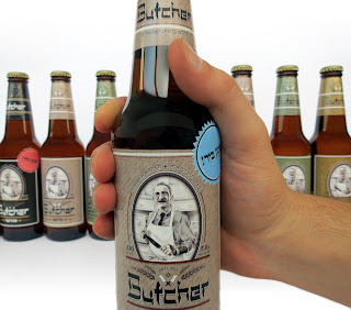
January 30, 2013, 12:40 am
![]()
Designed by
Nine Graphic Design,
Israel.
Design and art direction by Assaf Yogev and Uri Romano
Butcher is a small boutique brewery located north of Tel-Aviv, Israel. The simple (and very rare) brief was to keep the original name, Butcher, and to "have fun with it".
We suggested the idea of an old school, early 1900's, Jewish immigrant butcher, based on many east coast delis of that era (Kat'z in NYC, Schwartz's in Montreal, etc.) as a brand character.
The design draws from the original images and references of these relevant establishments to create a current style with a strong connection to that part in history. The identity combains illustrations, textures and Hebrew, English and Yiddish typography. Most notably in the logo, using Hebrew characters as English to look like Yiddish.
![]()
↧
January 30, 2013, 12:48 am
Designed by
Stelios Pseftogas of noon design, Greece.
Every time we are entrusted with the design of a wine label, we face the challenge with enthusiasm and respect to the product itself. The wine, as a cultural product, requires corresponding images to dress up the bottle in order to communicate the essence of its character. On the label of Sirius we were inspired by the rich ancient Greek mythology. Our intention was to illustrate a poetic image reflecting calmness and simplicity. The sketch of the black bird becomes the winged archer that passes through the moon's arc and scatters the heavenly firmament with golden and silver dust. The textured white paper becomes the night sky where Jupiter placed Orion and his dog, Sirius, after the desire of his daughter Artemis, transforming them into constellations. The use of metal foil, silkscreen varnish and relief evokes the sense of touch.
![]()
↧
January 30, 2013, 12:55 am
![]()
Designed by
Deda Designs,
Israel.
Deda Designs is a boutique design label specialised in kitchen accessories. Is was created by Saray Levin and Einat Nahary, two designers and two very close friends.
Among our products you can find printed aprons, cloth napkins and placemats, bamboo cutting boards and a great variety of printed kitchen towels.
The thought of originality, visibility and responsibility led us to look for a unique solution for our packaging. We decided to use recycled fast food packages, such as sandwich packs, salad containers and paper bags, to house our kitchen products.
Our goal is to introduce as many eco-elements to our manufacturing process as possible - in packaging, product, as well as factory compliance. Our packages are also considered as eco products, by meeting the base criteria of being either recyclable, reusable and responsible. They are free of any plastics, using only PET (recycled plastic) or PLA (cornstarch) materials.
![]()
↧


.jpg)
.jpg)
.jpg)
.jpg)
.jpg)
.jpg)
.jpg)
.jpg)
.jpg)
.jpg)


.jpg)
.jpg)
.jpg)
.jpg)


.jpg)
.jpg)
.jpg)
.jpg)
.jpg)
.jpg)
.jpg)


.jpeg)
.jpeg)
.jpeg)
.jpg)
.jpg)
.jpg)


.jpg)
.jpg)
.jpg)
.jpg)
.gif)


.jpg)
.jpg)
.jpg)
.jpg)
.jpg)
.jpg)
.jpg)
.jpg)
.jpg)


.jpg)
.jpg)
.jpg)
.jpg)
.jpg)
.jpg)
.jpg)