Quantcast
Channel: Packaging of the World - Creative Package Design Gallery
Viewing all 23894 articles
Browse latest View live

De Cecco Pasta (Student Project)

$
0
0


Designer: Anna Ahnborg, Sweden
Project Type: Project at School of Visual Arts, NY

Packaging and rebranding for De Cecco pasta. My goal was to give the packaging a traditional, rustic Italian, vintage look yet combine this with modern cutouts representing the shape of the specific pasta. The bold typography mixed with the monotony in colors and the feeling of the craft paper makes it stand out on the pasta shelf next to other brands. This is a School of Visual Arts project, issued by Louise Fili.

Read more

Cline Cellars

$
0
0


Agency: Auston Design Group
Printing: CCL Label
Project Type: Produced, Commercial Work
Client: Cline Cellars
Location: Emeryville, CA, US

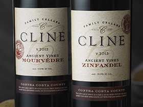
A well-established and trusted brand, Cline Cellars came to Auston Design Group for a redesign of their packaging system and overall brand experience. There was plenty to work with — a recognizable brandmark, a loyal following, a well-known location, and numerous wines. But it also featured the challenge of differentiating four very different tiers of wines under one unified brand.

Our update brought together previous brand elements with new elements to help promote that Cline is a family-owned, Sonoma County winery. We developed a brand system to distinguish the four tiers — while still allowing them to compete within their specific categories and price points. Throughout the design process we worked closely with the Cline family and marketing team to make sure we accurately represented the personality of the brand and the winery.

California Classics
Cline’s California Classics received a redesign that positioned it as a serious, yet humble and approachable Sonoma County wine brand. Large brand name, color and the equity of their previous large script C were folded into the design. Support copy tells the story of Cline’s sustainable farming practices and family-owned history.

Ancient Vines
This mid-tier crowd favorite is an obvious brand extension of the California Classics tier. Custom stamps depict aspects of the family’s history. A warm, earthy color palette lends a hand-crafted feel that helps communicate the fact that these wines are made with 100-year old vines.

Sonoma County
A higher-end line, sold primarily through the tasting-room and wine club, the Sonoma County tier was was inspired by many of the European varietals that grace this tier. We took a restrained approach to this design, utilizing classic French design cues like white space, beveled corners, Bordeaux red & Burgundy yellow capsules, along with high-quality bottles.

Single Vineyard
Cline’s single vineyard series is also primarily sold through the tasting room and wine club. Our approach was to present the brand in the classic refined look of a well established, heritage brand; be it European or Californian. Textured paper, scalloped corners, elegant type layout, a debossed seal, and lots of white space position the Single Vineyard tier as a solid and trustworthy luxury product.

The response from the trade and consumers has been overwhelmingly positive. And thus far, the sales back it up. Distributors are reporting an increase in sales to retailers by almost 10 percent.

Thank you to CCL Label, of Sonoma, CA, for another great job of printing, and whose expertise helped deliver these perfectly printed labels on their rocking state of the art Gallus RCS 430 press.
Read more

Supersemeyka

$
0
0


Agency: KULIBINBRAND
Project Type: Produced, Commercial Work
Client: TC Supersemeyka
Location: Rostov-on-Don/ Russia
Packaging Contents: Flakes
Packaging Materials: Paper and flow-pack

KULIBINBRAND developed the concept of flakes Supersemeyka

Branding agency KULIBINBRAND (Rostov-on-Don, Russia) has developed for the client company the concept of positioning, logo, packaging design and promotional materials for the new line of flakes Supersemeyka. The product target audience is a family, and the special focus group is the preschool and school age children. The basis of the positioning of a new line put the nutritional properties and a high energy potential of flakes.

What's Unique?
As a rule, most of the flakes producers represent a single image for all types of flavors, Supersemeyka flakes have unique stories related to "superheroes weekdays". Kulibinbrand has developed an original story for each product (currently five). Every story shows something extraordinary action with super heroes family, because they receive high energy from the Supersemeyka flakes. There are interesting "super ruses" for the real heroes on the lateral face on each box. The line will be presented on the market as cardboard boxes and in packets (flow-pack).

Read more

Square Mile Coffee Roasters

$
0
0


Designed by One Darnley Road and Square Mile Coffee Roasters
Project type: Commercial
Location: London, United Kingdom

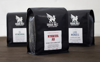
Square Mile Coffee Roasters is a multi award winning coffee roasting company established in 2008 and based in East London. We want to make London famous for good coffee. We source, buy, import, roast and deliver the best coffee we can get a hold of, and we never stop asking ourselves how we can make it even better.

It was time to reimagine our packaging across all aspects, and we begun by providing a local narrative by introducing a map of the former Square Mile of London as a textural element across all packaging media. Customer usability was at the forefront of the project, making use of a resealable ziplock section for easy accessibility and a label classification which coherently presents the individual coffee flavour notes, origin and processing information and a colour palette relative to roast style. Considerations were also made for in store shelf presentation, which due to the external welded pouch creates a more stable and uniform positioning of the retail bag for our customers to display in their cafes.

Read more

Waldorf Wine

$
0
0

Designer: Dominika Suszek
3D visualization: Marcin Sowiński
Project Type: Student Project
School: Polish-Japanese Academy of Information Technology
Course: Package design
Tutor: prof Henryk Chyliński
Location: Warsaw, Poland
Packaging Contents: Alcoholic beverages
Packaging Materials: Glass and Paper

Waldorf is the company I created for my thesis. I attended Package Design classes. I had to design packages, an advertising poster and also to make an animation about my company.

Waldorf is a vineyard from California. I chose California because of their great natural conditions to crop grapevine and also because I think it is one of the most amazing places on this planet. Waldorf philosophy is to lead optimistic life filled with fun and pleasure.

Waldorf logo is based on a letter W, because W is not only the first letter of the company but also of the product it sells – wine. It also resembles a wine glass.

The identity of the brand is a combination of classic and extravagance. My goal was to design unique labels that will stand out on a shop shelf and easily catch customers’ eyes. I believe I managed to achieve it by using colorful palette and stripes. My second purpose was to make my labels easy to remember and that is why they have such an extraordinary shape. Colors of the labels were chosen accordingly to wine species. In order to underline their unification, the typography is always in the same shades of grey.

Transportation packages: a gift box, wrapping paper and a paper bag are minimalistic and they all base on logo and logotype. A gift box bases on the shape of logo through triangle walls and slim construction. Wrapping paper is delicate but because of use of both, logo and logotype, it is very characteristic. A paper bag is made of ecologic paper and it similar to a gift box.

I wanted my advertising poster to emphasize class of wine, so I used a red wine glass. In my opinion there is nothing more timeless than a glass of good dry red wine.

I created my thesis in many different techniques. All my products were real are handmade. The multimedia part was made in programs such as: Adobe Photoshop, Adobe Illustrator, Adobe After Effects and Adobe Premiere Pro.

Read more

Slowlove

$
0
0


Agency: Mot
Art Direction & Graphic Design: Laia Clos, Kike Segurola
Photos: Javier Almar
Project Type: Produced, Commercial Work
Client: Slowlove
Location: Spain
Packaging Contents: Clothing, deco stuff
Packaging Materials: cardboard, fabric

Slowlove is a new multi-brand e-commerce that sells mainly clothing, accessories, deco objects and beauty stuff. The philosophy behind the brand advocates working with natural materials, made with care and attention to detail, as well as a firm commitment to develope sustainable creations. We did the whole identity and packaging items.

What's Unique?
We believe that the graphic solution provided to the identity and packaging responds perfectly to the philosophy and spirit of the brand.
Read more

Carpe Diem

$
0
0


Agency: 43'oz
Project Type: Commercial Work
Designer: Alex Kodimsky
Client: Carpe Diem
Location: Moldova

Seize the moment! Wine label design «Carpe Diem»

Studio 43'oz and a famous Moldavian wine room "Carpe Diem" present unique and a same-name wine "Carpe Diem" (lat. - Seize the moment).

The target audience of this product became young people who lead an active lifestyle, trendmakers, those who lives a full life. The customer and the wine author itself was ready for a new, creative approach for a product design, and the client addressed several agencies before settling upon a concept offered by our studio.

What's Unique
Special thing about the design of "Carpe Diem" wine is that it's not created by traditional stereotyped solutions that are usually used for wine labels. At the heart of a design there is expression and emotions which are more important in RTB-factor for chosen target audience.
Read more

Lyra Beer

$
0
0


Agency: A|S Advertising
Project Type: Produced, Commercial Work
Client: Mediterranean Microbrewery Of Crete
Location: Athens, Greece
Packaging Contents: Beer, Drink

Unfiltered and unpasteurised , fresh beer LYRA , can be found in the most beautiful parts of Crete and the Aegean, accompanied by folkloric music and sounds created by the playfulness of the sea on the coast. In such a gulf of Kissamos, the Mediterranean Microbrewery of Crete, handcrafts beer in limited quantities but with plenty of love and passion. Made from pure ingredients, Greek barley, carefully selected hops and highest quality yeast without any additives and preservatives.

The label design was inspired by the shape of the traditional Cretan musical instrument Lyra.
Read more

Tops/Roots (Student Project)

$
0
0


Designer: Anna-Maria Kandales-Vorobeva
Project Type: Student Project
School: Moscow State University of Printing Arts
Packaging Content: Organic Produce
Location: Russia

"Tops/Roots" — local organic vegetables and greens.

Design of this package based on the principle edibility part of the plant to show if it part is under the ground or over the ground. Reverse letter "K" remind about a little sprout.

There is no reason to hide that kind of product — the vegetable fresh and good by itself so it always speaks about itself better than picture or any word, so just put it in a transparent pack and sell.
Read more

Tok Watch (Concept)

$
0
0


Agency: SHERIDAN&CO
Project Type: Concept - packaging and product design
Packaging contents: Time piece, interchangeable watch strap, user manual
Packaging Materials: Cardboard
Location: London, United Kingdom

TOK WATCH CONCEPT PAYS HOMAGE TO THE TICKING OF TIME
TOK was invented from scratch to encompass a modern and simplistic timepiece for design-conscious consumers, while the packaging itself was composed to elicit a sense of surprise and reveal, enhance the aesthetics of the product and convey a sense of movement reflected in the passing of time, but in its purest and simplest form. The final design is clean and minimalist yet playful and dynamic.”

Drawing inspiration from the mechanical ‘tick tock’ of clocks, the timepiece itself is striking in its simplicity – monochrome, reductionist with the real detail in the long hand of the watch which is punctuated by just a single circle at its tip.

This detail might seem too tiny to be significant, yet it informs the overall look and feel of TOK’s brand identity and packaging. The logo itself is simply delineated, white-on-navy, with the design of the watch hands forming the ‘T’ and the ‘K’ of the font.

The tubular watch box echoes the circular composition of the classic clock face and deconstructs into three separate parts. This displays the watch, houses the instructions at the base, and separately compartmentalises an interchangeable watch strap.

The watch itself is strapped around a patterned tubular structure encased in the box. Here, the simple product design is offset by a replicated pattern of the watch arms, composed in alternate positions that create a vibrant abstract pattern that mimics movement and nods to the ‘tick tock’ dynamics of time passing.

Read more

Kaffeepur Architecture Edition

$
0
0


Agency: Neubau
Designer: Stefan Gandl, Neubau (Berlin)
Typeface: NB International™ Pro Bold
Project Type: Produced, Commercial Work
Client/Producer: Kaffeepur GmbH
Location: Berlin, Germany

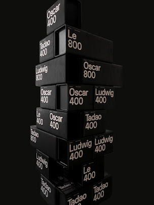
‘Le, Ludwig, Oscar & Tadao’ - Architecture Edition by Kaffepur
The philosophy of iconic modernist architects translated into the finest coffee

Packaging design for Kaffeepur (Swiss coffee roastery) and their special ‘Architecture Edition’. The first four different blends of the edition are dedicated to iconic modernist architects such as Le Corbusier, Ludwig Mies van der Rohe, Oscar Niemeyer and Tadao Ando.

Inspired by aforementioned architects Kaffeepur’s owner and coffee roast master Angelo Stäldi developed each blend carefully trying to interpret the individual’s aesthetics and philosophy by translating it into a unique coffee experience. Kaffeepur has branches in Zurich and Berlin.

Gandl’s packaging concept and design is inspired by the ‘international style’ era using a customized version of his recenlty released NB-International™ Pro typeface as the main design element. Containers of solid squarish cardboard boxes with an elegant oxidized black metal lid are designed to house the valuable blends safely. These robust boxes can be stapled and used as building blocks for houses almost. ‘Edition Architecture’ is available in 400g and 800g units.

Edition Architecture is exclusively available in special museum shops (i.e.: ARCAM Amsterdam) as well as in Kaffeepur’s very own flagship store in Berlin.
Read more

Windrun Pinot Noir

$
0
0


Agency: Mark Oliver, Inc.
Illustration: Tom Hennessey
Printing: Landmark Labels
Project Type: Produced, Commercial Work
Client: Windrun Wine
Location: Solvang, CA USA
Packaging Contents: Wine
Packaging Materials: Glass, Label-White Gloss 60# Litho with Permanent S-100R adhesive on a 1.2 PET liner. Lamination: Clear Gloss Polyproplene with Permanent Adhesive

A label as rare as the wine itself.

Pinot Noir produced in the Santa Rita Hills of Santa Barbara County is some of the finest produced anywhere in the world. Uniquely their own style, the wines are rich, with hints of minerals, tobacco leaf, pepper, red cherry, and strawberry fruit.

Windrun produced a limited production of 2013 SRH Pinot Noir to burnish the winery’s already good reputation with wine writers and knowledgeable consumers. They asked the group at MOI to come up with a label as classic as the wine itself.

What's Unique?
It is rare to see a wine label that is nearly all black. Using beautifully fluid letterforms, a vine drawn by renowned illustrator Tom Hennessey, and simple typography and color, we created a label of simple bespoke elegance. The most recent label printing technologies produced a mirror-like finish. Gold foil stamping, and rich, warm, colors help to give the label a stunning presence.

The new design ties to the brand’s primary labels by sharing elements, but treats them in a new fashion, creating a minimal, elegant, and distinguished label, worthy of the wine within.

Read more

One Seed Organic Perfume

$
0
0


Agency: Ennis Perry Creative
Design, Creative Direction & Packaging Design: Haydn Deane & Anne Mason
Project Type: Produced, Commercial Work
Client: One Seed Perfume
Location: Australia
Packaging Contents: Perfume

One Seed is a boutique Australian organic perfumery passionate about creating wholly natural products without compromising on beauty or quality.

A re-branding exercise, One Seed approached Ennis Perry Creative to developed the One Seed brand and give the business a fresh new look and feel that spoke the true essence of their brand, and set them apart in the market.

The studio created a unique brand and packaging solution for One Seed - a perfect case study on how effective design shifts perceptions and influences buying behaviour. The project resulted in a 200% increase in sales and evidence that the right branding can change a business overnight.

What's Unique?
The studio of Ennis Perry developed a unique brand for One Seed that exudes earthy luxury and sophistication, a luxe brand connected to nature. Branding was developed to bring a genuine, natural and intimate luxury to the customer.

Through the clever use of graphic elements and illustration the studio created a unique visual that embodies the brand ethos. Secondary patterns, typography and a earthy colour palette including a striking copper foil and white ink, all come together to form a beautiful and memorable brand.

The packaging solution for developed for One Seed is flexible & updatable, the solution allows for easy adaptability for new fragrances without major expense or production and importantly reduces any packaging going to waste – a sustainable solution for business and resources.

Read more

Penema Esterra Olive Goods

$
0
0


Creative Director: Chris Trivizas
Naming: Diamantis Diamantidis
Text Editor: Sissy Caravia
Font: Parachute
Print: Label Press
Photography: Math Studio
Project Type: Produced, Commercial Work
Client: Terra Farm
Location: Athens, Greece
Packaging Contents: Extra Virgin Olive Oil
Packaging Materials: Aluminium, Glass

Esterra is a family Company that deals with the cultivation, commerce and export of olive oil, as well as other quality products based on the olive. Our enterprise has as goal to develop and expand its activities to other agricultural products, cultivated in the fertile land of Messinia.

The name of the Company comes from the union of the archaic “es” (from) with “terra” (land, in latin) and its goal is to express the connection of the Company to the traditional cultivation and the purity of the products of this land.

The design of the symbol of its trademark also stems from the values that mark this Company. Thus, knowledge and tradition lead to the design of an eternal unique olive tree, which has a ladder as a trunk, an element that symbolizes at the same time the traditional way of collecting olives as well as the modern, dynamic prospects of the Company.

The packaging design consists of three tin containers (250/500/750ml) and three Dorica bottles (250/500/750ml). Having studied all aspects of the containers we created this label, which is the same for all containers and features an '’ear'’ that sticks out, creating extra space for the products’ written identity.

What's Unique?
Having studied all aspects of the containers we created this label, which is the same for all containers and features an '’ear'’ that sticks out, creating extra space for the products’ written identity.
Read more

BIGARDO - Rebel from Toro

$
0
0

Designer: Javier Garduño Estudio De Diseño
Project Type: Produced, Commercial Work
Client: Kino Calvo
Location: La Hiniesta, Zamora, Spain
Packaging Contents: Wine

Rebel, from Toro and 100% handmade. BIGARDO is the first work of Kiko Calvo, a young wine expert from Toro (Zamora). This experimental wine has been made in a 100% artisanal way: from the harvest to the tagging/labelling, joining innovation and tradition.In the wine area of Toro, this expression is used to describe a young rebel person, who doesn’t care about what other people think and does things on his own way. The concept in the label emerges under this premise. A picture of the oenologist’s hand, performing the sign of the horns, a hand gesture that means rebelliousness and refers to the place where this wine is made, because of its analogy to the horns of the animal that gives its name to the town. Each bottle is numbered manually, and the name is printed with an ink pad. The collar is made with a die cut, imitating the sign of the horns in a touch of originality.The outcome is a very transgressive and clean design, elegant and remarkable, and so is the wine inside the bottle.
Read more

Bintis Nut Butters

$
0
0


Agency: The Silot
Project Type: Produced, Commercial Work
Client: Bintis Nut Butters
Owner of Bintis Nuts: Winnie
Location: Kenya
Packaging Contents: Nut Butters
Packaging Materials: Glass Jars

Bintis is a thoughtfully crafted Kenyan brand that puts its customers needs front and center. Trust worthy. Delicious. Looks great! Winnie, owner and creator of Bintis a true nut butter fanatic and her idea is to share this passion with anyone who's interested in discovering a new world of flavors.

Bintis brand is a conscious lifestyle choice that leaves its customers feeling good about their food and health.They go the extra mile to get ingredients that are extremely high in quality, responsibly grown and benefit the farmer directly.

What's Unique?
To emphasize the natural ingredients in the products, we decided to use watercolor illustrations that focused on floral ingredients that highlighted the source of the nuts and natural essences. The initial intention of using a standard botanical illustration style quickly evolved into a more own-able brand. The watercolor style brought huge personality and vibrancy to the brand.


Read more

COOTA Cider

$
0
0


Agency: Pesign Design
Project Type: Produced, Commercial Work
Packaging Content: Sparkling Wine
Location: Shen Zhen, China

The product “COOTA” created an exclusive process of “Double fruit brewing ”. Using fresh quality apple as raw material , collocation different fruits . Rich in trace elements . Tastes fresh and delicious.

We using the frame of the fruit fell into the water to give consumers a clean and fresh feeling. The frame and the “COOTA” label group like an exclamation mark. This also represents the product of the taste and quality of the amazing. The color on the bottle is gradually changed, from deep to shallow, the final and the bottom of the wine body color perfect fusion. In order to guarantee the positive visual effect of the product, we put the secondary information on the neck of the bottle. The overall effect is simple and lively.
Read more

Sweet Heat Marmalades

$
0
0

Agency: Corn Studio
Project Type: Produced, Commercial Work
Client: Sweet Heat Marmalades
Location: Athens, Greece
Packaging Contents: Marmalade
Packaging Materials: Glass, Paper, Wood

“Sweet Heat” is a small business located in Athens, Greece. It produces handmade spicy marmalades out of four different pepper varieties. Carolina Reaper, Bhut Jolokia, Sweet Peppers and Moruga Scorpion˙ four of the most spicy peppers around the world.

Chefs love them because they can be placed on pasta, rice, meat, even on ice cream! Some of them are soft, medium, hot enough and others extremely hot. We designed six similar labels for the jars and six boxes. We chose to use pale colours, sans typography.

Sweet outside, heat inside!

Read more

Kaffe 1668

$
0
0

Designer & illustrator: Martín Azambuja
Project Type: Produced, Commercial Work
Packaging Content: Juice
Location: Montevideo, Uruguay

I had the opportunity to illustrate and design all the juice labels for Kaffe 1668 located in Tribeca, SoHo. There are lots of juices and each has its benefits. Illustrations are referred to the benefits of juice and feelings of consumers.

Special thanks to Joe Prince and Lost Type for the Majestic numbers.
Read more

Bonora Chocolates

$
0
0


Agency: Antonia Skaraki A.S.
Project Type: Produced, Commercial Work
Location: Athens, Greece
Packaging Contents: Chocolates, Desserts
Packaging Materials: Paper

BONORA is a pastry shop within a supermarket.

The usage of birds and hot air balloons depicts that the chocolates are "lighter than air".

Read more
Viewing all 23894 articles
Browse latest View live