Quantcast
Channel: Packaging of the World - Creative Package Design Gallery
Viewing all 23894 articles
Browse latest View live

Hikeshi

$
0
0

Agency: Futura
Photos: Caroga
Project Type: Produced, Commercial Work
Packaging Content: Clothing
Location: Tokyo, Japan

Hikeshi is a high quality clothing line that belongs to the Japanese brand Resquad. The general concept was inspired on the fire fighters of the XVII century, during the “Edo” Period (now Tokyo). They were considered as high ranked as samurais.

We designed a series of illustrations of these characters using technics inspired in Japanese art from the era. The typographic selection and color palette turns the brand into something modern, but the material’s selection, the composition, and the combination of elements altogether make Hikeshi a timeless brand.

Read more

Buen Pintor Spray Paint

$
0
0

Designer: Brian Piraquive
Project Type: Concept
Location: Bogotá, Colombia
Packaging Contents: Pintura, Aerosol

"Buen Pintor" is a Binner product, it is a multipurpose spray paint for amateur and professional use with plenty of years in the Colombian market. it is based basically on home spaces and nowadays is into the industrial field with the spray paint for high temperatures. The brand proposal for the spray bottle was to create just an artwork for all the references. To identify the color on every spray bottle there is a sticker that helps to this purpose, with this process printing cost are being reduced on the spry production. On the re-design process the inspiration was the actual logo, where the name has been painted freehand. Several calligraphy experiments has been made to achieve a suitable and readable logotype.
Read more

Love Guide Condoms (Student Project)

$
0
0

Designer: Guan-Hao Pan
Project Type: Student Project
School: National Taipei University of Technology
Packaging Content: Condoms
Location: Taiwan

Inspiration
A condom becomes much less effective if it is the wrong size, worn on the wrong side, or its tip is not squeezed when worn. It may cause pregnancy or/and sexually-transmitted diseases. Wrong Size Selection : Studies show that more than 60% of users choose a wrong size while shopping for condoms. In addition to discomfort, wrong size selection increases the risk of slippage and rupture. Wrong Use : The breakage rate can be increased by wrong use such as wearing the condom on the wrong side and failure to squeeze the teat end of the condom.

Concept
“Love Guide” condoms address these issues by introducing a new packaging system for conventional condoms. They come in five packages, each of a distinct diameter, such that holding the packages easily determines the right size. Also, each condom comes in a specially designed case with a rising tip, making it easy to pick the condom from the right side while squeezing the tip at the same time. Love Guide helps users choose the right condom and use it the right way!

Tools used
The graphics, logo, icon, typography, packaging and paper display stand were created in Adobe Illustrator, and some images were refined and adjusted in Adobe Photoshop.

Easy Production
Without having to make changes to current condoms, Love Guide improve existing problems by just changing the packaging design of condoms. With the practical idea that can be easily implemented for mass production, general public would benefit in a short time.

Easy Size Selection
Five different packages are available for customers to select depending on individual’s penis size. Each package is different in diameter and specified with a color as well as a label: cucumber, carrot, banana, turnip, and zucchini. Holding the package makes it much easier for buyers to determine which size fits them the best.

Easy Use
Each condom comes in a specially designed case with a rising tip, making it easy to pick the condom from the right side while squeezing the tip at the same time. They can be easily used in the dark, even by the blind. The speed of wearing Love Guide Condoms is faster than conventional packaging condoms more than doubled.

ECO-friendly
Conventional condom packaging is made of Foil and it’s difficult to recycle, it cause environmental pollution. The case of Love Guide Condoms made of environment-friendly PLA plastic, it is biodegradable and disposable.

Vending Machine
Love Guide Condoms can also be distributed via vending machines available. The customers can hold the model packages and select the appropriate package for purchase. In this way, the embarrassment associated with shopping for condoms is essentially eliminated.

Healthy Attitude
The idea of product package in the format of veggies is inspired by the Chinese saying that goes " 食色性也", which points out that sex is one of basic characteristics of human nature as well as food and we don't have to feel embarrassing using it. Using condoms packaged as the format of varied veggies is as normal as meeting our eating needs, so that act of using them is healthy and natural.
Read more

L'Artisan Confiturier (Concept)

$
0
0


Agency: Studio Kalumi
3D design: Juan Carlos Blanco
Project Type: Concept
Location: Barcelona, Spain
Packaging Contents: Jam
Packaging Materials: glass jar, aluminum lid, paper label


L’Artisan Confiturier is a fictitious french jam brand for which we wanted a bold and colorful identity, and to reflect the idea of high quality handmade products. We chose to use watercolor illustrations and hand lettering. The illustrations are used as a pattern for the label around the jar, and depict the content of the jams: only fruits! We also chose unique names for each taste, which adds a quirky touch to the products and helps making the products remembered.

The culture of cheese is very important in France, that is why we imagined this brand of jams not only for breakfast, but also as an innovative way to accompany and enhance the different tastes of cheeses.
The range features 6 tastes and unusual combinations, such as blueberry and chocolate, kiwi and lime, pear and ginger.

What's Unique?
The use of unique and quirky names for each taste helps making the product remembered by the consumer. The innovative concept of being a jam for toasts as well as to accompany cheeses makes it a unique product.
Read more

Cadbury Milk Tray

$
0
0

Agency: Design Bridge
Project Type: Produced, Commercial Work
Client: Cadbury
Location: London, UK
Packaging Contents: Chocolate

Design Bridge make Cadbury Milk Tray special again with new packaging design

Design Bridge today announce details of their work in designing new packaging for Cadbury Milk Tray. The redesign comes in Cadbury Milk Tray’s centenary year and re-establishes the chocolates as being a thoughtful and special gift-choice to give to friends and family.

Gemma Roche, Client Director at Design Bridge explains, “Despite being one of their oldest and best known brands, Cadbury Milk Tray had recently been overshadowed by competitors. Our research showed that the packaging had come to be seen as old-fashioned and they had gained the reputation of being a ‘last-minute gift’. It was our challenge to turn this around, re-discover what makes Cadbury Milk Tray unique and create packaging that’s as special as the feelings people once had for the brand.”

By asking people what their impressions of Cadbury Milk Tray were Design Bridge quickly discovered that many still had an underlying love for the chocolates. Gemma Roche continues, “The shapes of the chocolates themselves sparked the fondness that people had for Cadbury Milk Tray. The familiar shapes led people to reminisce about their Gran’s favourite strawberry cream, their childhood friend’s love of the hazelnut swirl and the family gatherings where a box of Cadbury Milk Tray would be happily passed around.”

Design Bridge selected the five most iconic chocolates, unchanged since the brand’s launch in 1915, and created hand-drawn illustrations based on their unique shapes and textures. These illustrations are used as 'hallmarks' for the brand, stamped in gold below the name. Kate Galle, Creative Director at Design Bridge explains, “Using the ownable hallmarks we created a fashion-inspired pattern, much like the prints seen on a designer scarf or beautiful paper-wrapping. We used the pattern like gift-wrapping to cover the box, reiterating the thought behind the gesture.”

The pink accent colour from the previous packaging now lifts the entire box, highlighting the unique pattern and giving the brand a new fashion-led, feminine appeal.

Kate Galle continues, “As well as becoming a precious gift, we felt that the patterned box also widened the appeal of Cadbury Milk Tray so it becomes a gift that a younger audience would gladly choose to give to their best friends, as well as their family. Presenting the chocolates as illustrated hallmarks on the front also gives a precious quality to the treats within.”

Also incorporated into the design is a gift-tag that brings together the Cadbury Milk Tray brand mark, royal warrant and the five new chocolate-shaped hallmarks that Design Bridge have created. This adds another layer of distinctiveness and meaning to the box and points to the preciousness of the chocolates inside. The gift-tag shape is also a playful nod to the iconic adverts of the 1980s in which the famous 'Milk Tray man' leaves a card with a box of the chocolates for his loved one.

Graham Shearsby, Chief Creative Officer at Design Bridge added, “Cadbury Milk Tray now embraces and celebrates what people love most about the brand. For the first time in 100 years we’ve brought what’s inside the box to the fore, reinterpreting this familiar selection of shapes and flavours to create a striking pattern and set of quality stamps for the brand.”

Benazir Barlet-Batada, Marketing Manager at Mondelēz International commented, “Design Bridge worked hard to understand the Cadbury Milk Tray brand and what makes it unique in people’s hearts. The new packaging design not only restores a sense of specialness, it builds on it and reaches out to a younger audience. We hope this will keep Cadbury Milk Tray alive for the next 100 years and beyond!”
Read more

PlayerTek

$
0
0


Agency: Grandson
Production: Lucas Promotions
Project Type: Produced, Commercial Work
Client: PlayerTek
Location: Dundalk, Ireland
Packaging Contents: GPS Tracking Unit for Sports
Packaging Materials: High Density Foam, Rigid Cardboard box, clear foil deboss, white foil deboss

PlayerTek is a sports based company producing high end GPS tracking units for athletes. The packaging had to reflect this and so we produced a rigid cardboard box in ultra matte card. The box is produced in three sections with - the lid which is clear foil branded, the inner section which has a flap lid and high density moulded foam to house the device, and the base which is rigid cardboard to house a garment and charger / printer literature.

Read more

Glennans

$
0
0


Agency: Fluid Ideas
Project Type: Produced, Commercial Work
Client: Glennans
Location: Derby, UK
Packaging Contents: Vegetable Crisps

Carved and cooked in rural Staffordshire, Glennans is one of the UK’s favourite brands of vegetable crisps found on the shelves of supermarkets and farm shops nationwide. We were appointed to refresh the brand and packaging, focusing on the need to inject more personality and appetite appeal whilst building an engaging story around the provenance of the crisps. We’ve always loved packaging projects, so the opportunity to work with a local company on a national project was great fun. Poetry and parsnips it just works!

Read more

Zigzag Cans

$
0
0

Designers: Jawad Qumsieh, Noor Oran
Additional Credits: Nassouh Kharsa, Limelight Creative Agency
Project Type: Produced, Commercial Work
Client: ZIGZAG
Location: Amman, Jordan
Packaging Contents: Beverages
Packaging Materials: Aluminium

Packaging design for ZIGZAG beverages, a refreshing drink, which grows from strength to strength in the full strength energy drink market, here it is, smooth, clean and sophisticated, the perfect base to any event.

A project we had a great time working on using brushes, paint and fun!
Read more

Clouds Packaging

$
0
0


Agency: Alexey Malina Studio
Illustrations: Veronika Kozachenok
Letterpress: Demon Press
Production & Consulting: Petr Chistov "Imprenta"
Photo: Alexey Sulima "Yoko Foto"
Project Type: Produced, Commercial Work
Client: *Neproneft
Location: Moscow, Russia
Packaging Contents: Clouds
Packaging Materials: Cotton wool

*Neproneft company doesn’t speek about politics, trends and fashion. It tells another story. A story about attention to details, beauty, talented people, inspirational events, art and amazement. The Clouds is unusual project of this company, which gives an opportunity to touch the sky.

In collaboration with Yana Kushnerova, art-director of *Neproneft company, we created a concept of Clouds packaging and made it real in several forms. Each package contains an instruction, which helps each Cloud to find it’s place at home.

Read more

Present / Tense (Student Project)

$
0
0


Designer: Fabian Fohrer
Project Type: Student Project
Location: Constance, Germany
Packaging Materials: Concrete, Paper

Present/Tense is a concept for a special edition for Seattle-based rapper Grieves. The hand-poured concrete box contains his studio albums and additional audio material as well as a booklet. Lyrics of his songs are visualized on each album cover.

Read more

MUSQ Natural Cosmetics

$
0
0


Agency: Black Squid Design
Designer: Rowan Laubsch
Creative Director: Derek Butler
Project Type: Produced, Commercial Work
Client: MUSQ
Location: Australia
Packaging Contents: Cosmetic, Skincare, Candles

Musq is an Australian Made, natural cosmetic and skincare company. Founded on an unwavering commitment to providing luxurious, clean, natural and ethical products, Musq is free from harsh chemicals, fillers and against animal testing.

Black Squid Design created a bold, yet fluid, custom logotype and set this with simple, structured typography to create a sleek, honest image for the brand. Across the range, labels consistently feature type falling vertically from the top with the limited black and white colour scheme. Variation in the use of black and white, container shape and the changing scale and orientation of the logo not only help to differentiate products, but also make the design more dynamic, adding visual interest to a modest brand.

Bold, graphic collages of natural botanical imagery are introduced exclusively through the candle packaging, displaying ingredients unique to the scent of each candle. This extension of the brand adds vivid colour, and natural imagery without compromising the original simplicity and elegance.
Read more

Gorget (Student Project)

$
0
0


Designer: Natalia Wysocka
Project Type: Student Project
School: Academy of the Fine Arts
Course: II Pracownia Projektowa
Tutor: Sławomir Witkowski and Adam Świerżewski
Packaging Content: Wine
Location: Poland

The word "Gorget" came from the French word "gorge" which means throat, was originally a band of linen wrapped around a woman's neck and head in the medieval period. Later, it was evolved into the knight's circular neck protectors that were worn under the breastplate armor. Ultimately, the main aim of the gorget is to protect, packaging was also created to do the same.

Natalia made used of this idea to design this lovely packaging which perfectly encase a bottle of wine, adding a new dimension it.

Read more

Saudade Tea

$
0
0

Brand: Saudade Tea
Packaging Content: Tea Leaves
Location: Japan

If someone asked you "When did you last drink some really good green tea?”, how would you reply?

For Japanese people, they might say "Earlier today." Green tea is everywhere here. Walk into a convenience store or sit down in a restaurant, and there it is, affordable, reliable, healthy and delicious. But does this simple day-to-day experience convey the full charm of tea? Doesn't the world of tea have much more to offer?

We have turned from the world of education, to the world of tea.

Why did we move from one field to a completely different one?

The inspiration came by chance, while drinking some green tea abroad. The realization that our perception of tea is not the same as others', that the tea we thought we knew, we don't really know at all.

We decided, then, to start taking tea seriously. First, we worked hard to earn qualifications as tea instructors, a tradition dating back hundreds of years. At the same time, we travelled throughout Japan, thoroughly sampling all the wide variety of tea that the country has to offer. Here and there we wandered, from tea shop to tea shop. Later, we began to wonder what the growers of the tea had to say about their craft, so we began to visit tea plantations regularly, to speak with them.

Drawn deep into the world of tea, we became attracted to something even more special - organic cultivation. We spoke with farmers who grow their tea without relying on chemical pesticides or fertilizers, preferring to use the local soil, flora, and fauna. Looking back, maybe this was a natural path for us to take, given our experiences farming in Brazil and working in environmental conservation in the UK.

With the help of our partners, the organic tea growers of Japan, Saudade Tea has taken a first, small step on a new and exciting journey. We hope our future allows us to share the pleasure of fine organic green tea with all the people of the world, and perhaps to one day create a global "Green Tea Culture."

Pictures and text exclusively given by Mr. Makoto
Read more

Marine Wine

$
0
0

Designer: Andriy Muzichka
Project Type: Produced, Commercial Work
Client: Granvik Shipping SA
Location: Ukraine
Packaging Contents: Wine
Packaging Materials: Paper

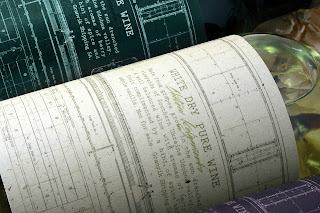
Granvik Shipping SA, a large player in sea freight transportation, has decided to surprise its customers on the eve of holidays. We created a series of exclusive wines with names of ships and their actual schemes with technical details.

Read more

Bombones 1908

$
0
0


Agency: Idearedonda& Mara Rodríguez-Design
Project Type: Produced, Commercial Work
Client: Embutidos el Hórreo
Location: Gijón, Asturias, Spain
Packaging Contents: Salted Chocolates (cheese & white chocolate/ meat & milk chocolate)
Packaging Materials: Paper

A packaging design carried out in collaboration between the designer Mara Rodríguez and the Marketing Agency Idearedonda

These gourmet chocolates have been created by the brand El Hórreo in partnership with Michelin starred Chef from Northern Spain, Jose Antonio Campoviejo.

They are more than just a simple sweet, they are a sense experience only for expertise and culinary people. Cabrales (typical Spanish cheese) with white chocolate and Sabadiego (typical Spanish meat) with milk chocolate, two salted combinations that have to be eaten as an appetiser and that will make you live an unforgettable experience.

In order to transmit all those feelings we have create a smart, clean and golden packaging, playing with typography and trying to transmit to the consumers that they are going to buy a high-quality and original product.
Read more

Telus Makeover

$
0
0


Agency: Gelcomm
Client: TELUS Communications
Location: Los Angeles, CA

At Gelcomm we believe in providing consumers with an experience from the moment they interact with a product, the first touch-point. This moment is critical and fleeting, hence the brand and package aesthetic must push through the shelf to make an impact. To put our beliefs to the test as we accepted the challenge to refresh TELUS Communication’s prepaid smartphone packaging. The goal was to redesign TELUS’ prepaid packaging to be more friendly and inviting. TELUS wanted the packaging to serve as a breath of fresh air on the shelf – clean, simple, small, and eco-friendly – and connected to the youth and credit challenged. This redesign was about creating a package that was sustainable and eco-conscious; it was about taking risks. We pushed the envelop by taking the time to craft a design that went beyond the brief and brought a vision to life.

TELUS asked us to respect their brand guidelines and keep the packaging cost within reason. This included minimal cardboard coating, no plastic trays, no foam packaging, no varnished elements that are not recyclable and no use of vegetable inks and non-toxic glue.

Read more

Tomin Bread - Chudo Rozh Rye-bread

$
0
0


Agency: Pavlov's Design
Project Type: Produced, Commercial Work
Client: Elita-Khleb-Service LLC
Location: Ryazan, Russia
Packaging Contents: Bread

Chudo Rozh rye-bread, a specialty from Pavlov's Design and Tomin Bread, is made from 100% rye using the new technology. Beaten and puffy, it is so different from traditional rye-bread and truly delicious. The design stands out too. The hand-drawn packaging reflects the natural ingredients of the product while its bright and summer colours distinguish it from its competition on the shelf and draw the customer's attention. When you get such package in your hands, you will certainly appreciate the drawings and the benefits of the new product.
Read more

gQlab

$
0
0


Designer: Jung, You-jin (in-house designer)
Company: Ildong Pharmaceutical., Ltd.
Project Type: Produced, Commercial Work
Location: Korea, Republic of
Packaging Contents: Probiotics, vitamin, supplement

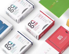
gQ lab(jikyu rap] is a brand new product of ILDONG Pharmaceutical that specializes in probiotics. It was made on continuous research results and advanced technologies through the most competitive production facilities.

gQ lab(jikyu lab) products have been applied to the world's first quad-coating patents. Through this patented technology to reduce the loss of live probiotic bacteria of the distribution process and to strengthen from the gastric acid and bile, gQ lab(jikyu lab) are designed probiotics to reach live up to intestine.

Strategies for the package design of gQ lab are as follows:

First, the layout is designed with powerful BI image in order to enhance awareness of this new brand product. Also, we made new Logo which means gQ(Gut Quotient) that Ildong suggest. To be specific, 'g' means reminiscent of intestine, and 'Q' means dashboard to measure the dimensions. These logo will make consumer aware of the benefit of this product intuitively. As a result, the layout of packaging design implies that the image of the product for managing every day systematically.

Second, we need a unique design that can ensure strong product competitiveness because of the many competitors in the probiotics market. So, we make this unique design whose motif is elastic band of Moleskine note.
This form can enhance the convenience in the opening and closing and the possibility of ongoing medication compliance. As a result, the packaging design makes it possible to store and keep rather than for single use only.

Third, design uses only minimum symbols and texts to deliver clear effectiveness as a functional supplement. This design is simple, but has clear message that consumer need most. And this design can make true and sincere image of our brand.

Read more

Buttonwood - Cafe and Bakery (Student Project )

$
0
0


Designer: Annie Wu
Project Type: Student Project
School: Pratt Institute
Course: Senior Project
Tutor: Professor Roberts
Location: Brooklyn, New York
Packaging Contents: Cafe and bakery packaging, rendering of shop and model of interior
Packaging Materials: matte board, paper, hand drawn designs

Buttonwood is a bakery and cafe located on Main Street in my hometown, Pleasanton, California. The name was inspired by the original name of the town after the sycamore tree. Using the leaves and objects identified with the shop, I created the design with pencil and scanned the black and white illustrations for color editing.

The model of the interior of the shop was constructed with paper of various weights and boards, revealing the front of the shop where the goods are sold. The cafe is in the back of the shop and a narrow hallway leads to the kitchen.


Read more

Turmeric Drinks

$
0
0


Agency: Sump Design
Designer: Zi Huai Shen
Project Type: Produced, Commercial Work
Client: DINGDA Marketing Co., Ltd
Location: Taiwan

SUMP Design created the brand out of 'Gu Shen Tie' in Taiwanese means taking care of bodies. On the basis of Kampo posts, SUMP Design created a brand logo and integrated a new vision compared with its old brand identity.
Read more
Viewing all 23894 articles
Browse latest View live