Quantcast
Channel: Packaging of the World - Creative Package Design Gallery
Viewing all 23894 articles
Browse latest View live

Saxa Rebrand

$
0
0


Creative Agency: Robot Food
Project Type: Produced, Commercial Work
Client: Premier Foods - SAXA
Location: Leeds, UK
Packaging Contents: Salt

A dash of strategy, a twist of inspiration and a pinch of heritage transforms Saxa into a brand that’s more than worth its salt.

To many UK households, Saxa is salt. Saxa has been around since 1907 and is one of the UK’s better known heritage brands. Premier Foods asked Robot Food to reinvigorate this trusted brand with a stronger, fresher purpose, contemporary appeal and to give it pride of place again in UK kitchens. The rebrand would include fine table salt, cooking salt and Saxa So-Low, as well as rock salt, sea salt and new, more premium products.

Read more

Cuckoo Cidre

$
0
0

Creative Agency: RYSKA Design
Project Type: Produced, Commercial Work
Packaging Content: Cider
Location: Kyiv, Ukraine

If we add a pinch of unusual fruit combinations to the traditional cider, we will get a completely new drink.

The idea to hide the juicy watercolor fruit in classical engravings illustrates let us get across the main concept of the product: a crazy taste that turns a head even of the most decent person. The purpose of this design is to carry away to a fantastic world, where an orange slice replaced by a bicycle wheel and all your tricks are allowed. We chose the name “Cuckoo” as a perfect match with the brand. After all, this is the case when not only the contents but also the packaging drive you to the most eccentric pranks.

Don’t get mad get the cuckoo!

Read more

Uradi se čoveče Board Game (Student Project)

$
0
0


Designers: Pavle Ćirić& Ljubica Đorđević
Location: Belgrade, Serbia
Project Type: Student project
Packaging Contents: Board game
Packaging Substrate / Materials: Paper, Cardboard
Printing Process: Digital printing

"Uradi se čoveče" is a board game with a goal to create fun moments for the players. Theme of the game is a parody of all the things that can happen in the club. The maximum amount of players is four.

The players have to go through a lot of obstacles to get to the end by rolling the dice. "Uradi se čoveče" is full of events which make the game interesting all throughout. For example, your character can see hallucinations, get wasted and get in trouble in many different ways.The point of the game is not to promote narcotics or any addictive substances.

Read more

Airship (Concept)

$
0
0


Creative Agency: friendship
Project Type: Concept
Location: Antwerp, Belgium
Packaging Contents: Various items
Packaging Substrate / Materials: Cardboard, plastic

Currently there’s about 8.300.000.000 metric tons of plastic on our planet. Of this, 6.400.000.000 metric tons or 79% is waste and posing a direct threat to our planet. And the problem is getting worse by the day.

By 2020 more than 2 billion people will be using parcel services to send packages around the world. While positive for our economy, the plastic inside those packages is not so benign and will only add to the massive plastic waste that has already permanently affected our biosphere.

Read more

Thise

$
0
0


Creative Agency: Jacob Jensen Design
Project Type: Produced, Commercial Work
Client: Thise Majeri
Location: Roslev, Denmark
Packaging Contents: Dairy Products
Packaging Substrate / Materials: Paper, Cardboard, Plastic

The Danish organic dairy company, Thise, has been on a tremendous growth path for the last 25 years. All this has happened without any master plan as to what their graphic profile should look like.

Coming up on their 25-year anniversary, Thise decided that it was high time to get a grip on their many graphic expressions. They joined forces with Jacob Jensen Design. The result was a revitalised corporate identify and a packaging design guide.

A beautiful, lively colour scheme based on the already established traditional colours for Danish dairy products. A consistent splitting up of information into primary, secondary and tertiary levels and a clear-cut and yet classic logotype.

Altogether a profile of iconic simplicity that sends a powerful, intuitive signal and makes Thise products stand out visually and qualitatively among the other items in the dairy aisle.

What's Unique?
A beautiful, lively colour scheme based on the already established traditional colours for Danish dairy products. A consistent splitting up of information into primary, secondary and tertiary levels and a clear-cut and yet classic logotype. Altogether a profile of iconic simplicity that sends a powerful, intuitive signal and makes Thise products stand out visually and qualitatively among the other items in the dairy aisle.


ROCK'N'DOGS - Takeaway Food Packaging (Student Project)

$
0
0


Designer: Karina Pasechka
Project Type: Student Project
School: Lviv National Academy of Arts
Course: Packaging design
Tutor: Petro Nahirniy
Location: Lviv, Ukraine
Packaging Contents: Hot dogs
Packaging Substrate / Materials: box/corrugated cardboard
Printing Process: Digital printing

The main idea of creation this packaging is ease of use. As for me, it's the most important part of packaging design. I decided to create an easy-to-use package for hot dogs. As hot dogs are street food, the packaging should be comfortable in any situation. Even if you eat on the go, in the car or in the park.

The boxes created from corrugated cardboard. This is a secondary raw material, that doesn't harm the ecology. The use of secondary raw materials prevents deforestation. Also thanks to the micro-angle, the temperature of the meal are decreases more slowly.

The visual aspect of this project:
Complicated illustration of visitors of the snack-bar with food in them hands. Atmosphere of the Rock'n'Dogs place are friendly, so I decide to reflect it on my illustration. It's served as the main content for my design.

Read more

The Wrapping Paper Bag

$
0
0


Art Director: Sue Lope
Project Type: Produced, Commercial Work
Location: Hamburg, Germany
Packaging Contents: Shopping bag
Packaging Substrate / Materials: Paper

Supermarkets are replacing their plastic bags with more earth friendly solutions, such as paper bags. But since only a few people reuse them or recycle them, they end up piling up in a cabinet at home. By printing patterns inside of the bags we give them another meaning. Once they retire as shopping bags they can also be used as wrapping paper.

Read more

Lufthansa First Class Amenity Kits

$
0
0


Creative Agency: Jacob Jensen Design
Project Type: Produced, Commercial Work
Client: Lufthansa
Location: Frankfurt, Germany
Packaging Contents: Amenity products
Packaging Substrate / Materials: Textiles

Jacob Jensen Design has become a member of an exclusive group of design studios selected to contribute to the premium ambiance on Lufthansa’s highly rated First Class offerings.

The amenity kits are designed to fit Lufthansa’s image combined with Scandinavian design language and values to contribute to a pleasant journey for First Class Passengers.

The shape and the visual expression of the amenity kit is inspired by the JACOB JENSEN logo that visualizes the contrast between night and day/light and dark. The two-coloured circle also becomes a symbol for the flight, where passengers travel between night and day.

Read more

Nature Collection Retouch Cushion

$
0
0


Company: The Face Shop
Project Type: Produced, Commercial Work
Location: Seoul, Korea
Packaging Contents: Cosmetic
Packaging Substrate / Materials: Plastic

Nature Collection Retouching Cushion has a design incorporating the pebble motif inspired by nature. Available in mini size, the cushion is an essential item in your makeup pouch.

The Retouch Finish Formula optimized for corrective makeup comes with a Retouch Cushion that can help you naturally correct your smudged makeup in the afternoon. Makeup Cushion helps you achieve a freshly powdered look; every time you pat, your makeup looks as if it’s freshly done in the morning. Mild Sun L Formulated with inorganic sun block ingredients. Mild Sun Cushion protects sensitized skin due to ultraviolet light and harmful elements in the environment.

Read more

Sano

$
0
0


Creative Agency: Clinic
Project Type: Produced, Commercial Work
Packaging Content: Food
Location: London, UK

Creative agency Clinic today announce details of their work creating the branding and identity for Sano: an exciting new food brand which aims to empower people to make the best nutritional and wellbeing decisions in their everyday life. The founders are passionate about evidence-based nutritional science and both Dale Pinnock and Heather Richards, being nutritional experts, ensure every aspect of the brand is based on scientific facts not transient health fads. Sano are launching their first ‘food-to-go’ shop this week (w/c 24th July) on London’s Gray’s Inn Road.

In creating the brand for Sano from scratch, Clinic’s main challenge was to communicate the brand’s real point of difference - seriously tasty food based on sound nutritional science - in a saturated ‘healthy eating’ market.

Read more

Strap Tank Brewery

$
0
0


Creative Agency: Helms Workshop
Project Type: Produced, Commercial Work
Client: Strap Tank Brewing
Location: Springville, Utah, USA
Packaging Contents: Craft Beer
Packaging Substrate / Materials: Glass
Printing Process: Offset, screen printing, emboss, dome UV

“They don’t build ‘em like this anymore.”

It’s a phrase you hear often at Strap Tank, a brewery experience like no other in the country. The concept: a meticulously designed building pairing a bustling brewpub with the country’s most impressive collection of pre-WWII motorcycles. What in theory might seem an odd pairing makes perfect sense when you walk into the Springville, Utah taproom.

Named after the first Harley Davidson to roll of the line in 1908, Strap Tank honors the heritage, passion, and quality workmanship of its namesake. Tucked into the foot of the Wasatch Mountain range, the brewery is housed in a scale replica of Harley’s very first factory. The attention paid to the most minute of architectural details mirrors the attention and care shown in brewing their beer. At the center of Strap Tank’s philosophy is a deep commitment to craft and a relentless dedication to making things that are built to last— from the beer to the building it’s served in.

Read more

elit Vodka

$
0
0


Creative Agency: JDO
Project Type: Produced, Commercial Work
Packaging Content: Vodka
Location: UK

JDO designs 2017 USHUAÏA Ibiza Beach Hotel Limited Edition bottle for elit® Vodka

Following two consecutive years of success, elit® Ultra Luxury Vodka and Ushuaïa Ibiza Beach Hotel have come together for their third year of partnership to celebrate the party all summer long.

JDO, an award-winning UK-based design studio, has created the limited edition bottle for the second year in a row, aiming to push the boundaries of contemporary luxury experiences. The 2017 edition comes in a part-frosted glass bottle, designed to symbolize elit’s unique freeze-filtration process for unparalleled purity.

The frosted design then gradually descends into smoky grey darkness, inspired by the resort’s vibrant energy from hazy warm days into dramatically dark nights. The Ushuaïa Ibiza Beach Hotel hummingbird rests on the front of every bottle, boldly standing out in red against the monochrome day-to-night canvas.

Paul Drake, JDO co-founder and Executive Creative Director commented “We are thrilled to work with elit once again to celebrate their iconic partnership with Ushuaïa. This year, elit’s signature clear bottle has been switched for a monochrome aesthetic, mirroring Ibiza nightlife in stylish spirit and creating a truly memorable limited edition. We’re staying true to elit’s unparalleled dedication to purity, and at the same time, showcasing what sets it apart from other vodkas - its commitment to elevate people’s experiences in the nightclub culture of today."

The first 2016 limited edition design was a great success. This earned JDO the winning of the 2017 World Drinks Award Best Vodka Design and subsequent Best Design Agency.

The bottle will be available for purchase at Ibiza airport, Ushuaïa Ibiza Beach Hotel and top accounts in 11 European countries from May.

“With the success of our partnership in previous years, we’ve set the bar high,” said Piet-Hein Schnellen, elit Global Marketing Manager. “But we’re expecting the 2017 sequel to reach even more shelves and glasses. We can’t wait to toast Ushuaïa’s summer visitors whilst we enjoy the world’s best music and party scene.”

Read more

Money in Packaging: How It Drives Up Sales

$
0
0
Minute Maid redesign by Taxi Studio

Written by Claire, she works in marketing team at Brillopak, a premium quality, small footprint Robotic Packaging Systems.

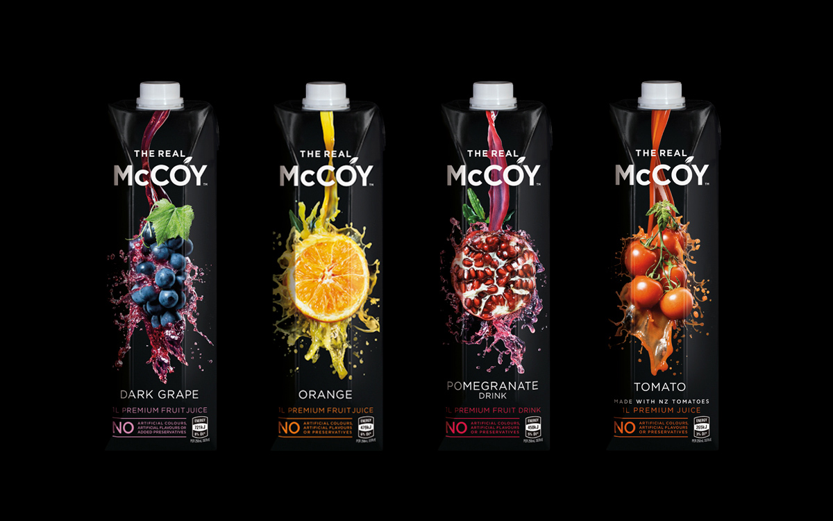
Amidst the flurry of products, both old and new, on the market, it is a challenge to stand out from the crowd. As marketers, it is important to pay attention to everything about the product; from how it’s manufactured to how it looks and to where it’s placed. These are all essential in ensuring that your target market is aware of your product and it is available and accessible to them.

In marketing, there is a concept called the 4Ps – place, promotion, price and product. Place is all about ensuring that your product is easily accessible and available to your consumers. Promotion aims to increase awareness, equity, or loyalty to your brand. Price is competitively setting the price of your product depending on your target market. Finally, product includes everything about your product from its features, services, manufacturing and, of course, label and packaging. The 4Ps of marketing must all be considered when strategizing for a marketing campaign and must be able to interact and work well together.


McCoy Juices designed by Dow Design

Packaging is a part of one of the 4Ps, the product. It is very essential to how your target market will remember your brand. According to a research conducted by The Paper Worker, around one-third of buying decisions are affected by product packaging. Think of yourself in a supermarket, in an aisle with dozens of brands of, for example, corned beef. You see cans with a wide range of colors from reds to blues that are desperately trying to get your attention. Suddenly, you see an elegantly white-packaged can of corned beef and you become curious that you are eventually convinced to try out the product. This is what Filipino-made corned beef, Delimondo, has accomplished. Its packaging is a relief from all the cliché bright reds with pictures of the cooked product on most corned beef cans.

Here we see how packaging alone can drive the sales of a product. According to the same research by The Paper Worker, businesses that made packaging efforts had a 30% increase in consumer interest. Aside from increasing the chances of purchases, an attractive and effective packaging can also move a person to share it with their friends and family. Given that social media is now an important tool in information dissemination, more people now get to see your brand from a single post. Imagine if a person shares a photo of a brand on her social media; a social media friend then sees that post and shares it to her own friends. It’s a continuous cycle of sharing that allows your brand to reach more people than it can 10 years ago. This awareness, of course, is essential to convince people to try out your brand, and therefore significantly impacting its sales.

Effective packaging also allows your brand to be memorable. The study by The Paper Worker shows that consumers only spend an average of 7 seconds looking at your product; so make those 7 seconds count! A memorable packaging also makes it more convenient for your consumer since a packaging that stands out will make it easier for consumers to find the product. If your brand has a remarkable logo and is on the packaging as well, it can also influence consumer purchasing decisions.


After brand awareness and repurchase comes loyalty. A brand successful in sticking to the minds (and hearts) of the customers now has the ability to create relationships with their consumers. Logos often emanate feelings from the consumer’s past experiences with the brand. This also has something to do with the perception of consumers with the brand, which is called brand equity. In a blind test, more participants actually chose Pepsi over Coca-Cola; but once they can see the beverages being offered to them, they immediately switched to Coca-Cola. This was termed the “Pepsi Paradox.” When choosing between brands, consumers also subconsciously include emotions towards the brands when making a decision, as found in the Pepsi vs. Coca-Cola blind tests. The packaging and the logo are both associated with your brand and therefore represent them as well; combining these with a positive brand equity and you will be able to create long-lasting relationships with your customers. After all, it is said that it is cheaper to maintain loyal customers than it is to pull in new ones.

As demonstrated by a lot of brands, packaging can in fact do wonders for a product. It is just an element of a wider marketing strategy, but an essential one nonetheless. There is a lot more you can do with how you present your product and is not limited to the traditional packages for various brands. Thinking out of the box can always go a long way and will give you better results in terms of attracting consumers and ensuring that that they repurchase your product. Packaging and sales are connected and the companies that make efforts to make unique and remarkable packaging for the products are those that eventually thrive in the marketplace.

SOURCES:
http://www.marketingprofs.com/chirp/2014/25957/how-product-packaging-affects-buying-decisions-infographic
https://www.psychologytoday.com/blog/subliminal/201205/why-people-choose-coke-over-pepsi


About the author
Claire works with Brillopak which provides many automatic food packing machine, semi automatic packing machine, manual packing machine and many more. With her endeavors, Claire has immense knowledge about the industry helping clients ease-up their packing jobs. You can get in touch with Claire anytime you want and she will be happily ready to help you out regarding any queries or regarding the purchase of packaging machines.


Organo (Concept)

$
0
0

Creative Agency: BrandMEA
Project Type: Concept
Location: Cairo, Egypt
Packaging Contents: Chicken
Packaging Substrate / Materials: Plastic

Established in 2012, the Organo group has rapidly grown into one of Egypt’s leading suppliers of healthy, hygienic and nutritious poultry products. Offered through its internationally recognized Organo chicken brand as part of its ongoing efforts to meet customers’ needs and provide tasty, nutritious and healthy options. Organo has recently launched a frozen Chicken range

Read more

Healing Blends

$
0
0


Creative Agency: twomatch
Project Type: Produced, Commercial Work
Client: HealingBlends
Location: Thessaloniki Greece
Packaging Contents: Nutritional Supplements
Packaging Substrate / Materials: Plastic Bottle
Printing Process: Digital Printing

Product series redesign for Healing Blends company based in the USA. Keeping white color as base, a virtual identity with triangular patterns and serif / san serif was used, following the logo style.

Read more

130

$
0
0


Creative Agency: Gitanos
Photography: Paul Aragón
Project Type: Produced, Commercial Work
Client: Armonía Botanica / 130
Location: Costa Rica
Packaging Contents: Peanut Butter
Packaging Substrate / Materials: Glass bottle
Printing Process: Digital

130 is a peanut butter cultivated by hand by Central American farmers and delivered to our Costa Rican cuisine.

The project is inspired by botanical illustration to communicate the organic, natural and artisanal brand of Armonía Botánica and its product 130.

Read more

ESCAPE.

$
0
0


Creative Agency: Panama
Project Type: Produced, Commercial Work
Location: Italy
Packaging Contents: Fashion
Packaging Substrate / Materials: Plastic

PANAMA presents the ultimate clothing revolution for immediate evasion from stress and routine. The ESCAPE T-SHIRT keeps you safe from monotonous tasks and random annoyance. Thanks to its anti-boredom system, it protects you from super tedious dudes or boring conversations.

Read more

DANZKA Vodka

$
0
0


Creative Agency: Jacob Jensen Design
Project Type: Produced, Commercial Work
Client: DANZKA (Waldemar Behn GmbH)
Location: Eckenforde, Germany
Packaging Contents: Vodka
Packaging Substrate / Materials: Aluminium

DANZKA Vodka was established in 1989 in Copenhagen and is today owned by the German company Waldemar Behn GmbH. Jacob Jensen Design was asked to revitalise the DANZKA visual communication to bring it back to its Danish roots.

The new visual identity focuses on the unique and functional aluminium bottle as a classic piece of Danish design. The entire identity is consequently based on creating a simple Nordic atmosphere around the product to highlight its Danish origins.

Simultaneously, DANZKA THE SPIRIT – a new premium vodka was launched. Jacob Jensen Design was behind the new graphic interpretation of the iconic bottle.

Read more

Heir Apparent

$
0
0

Creative Agency: CF Napa Brand Design
Creative Principal: David Schuemann
Art Director: Antonio Rivera
Creative Director: Kevin Reeves
Project Type: Commercial Work
Client: Grand Napa Vineyards
Location: Napa, CA USA
Packaging Contents: Wine
Packaging Substrate / Materials: Glass/Paper
Printing Process: Offset pressure sensitive

Grand Napa Vineyards came to CF Napa with the opportunity to launch a premium red wine into their portfolio. The design for this brand was inspired by the idea that great wines are inspired and improved by the lineage of great winemakers and wine that preceded them. The artistry of winemaking of each new vintage is the culmination of learning and technique learned through the years. The design makes use of a historical "family tree" of exceptional winemakers and those who proceeded and thus contributed to this exceptional wine.

Read more

Adnams: LongShore & First Rate

$
0
0


Creative Agency: CookChick
Director: Lee Cook
Designer: Adam McCarthy
Project Type: Produced, Commercial Work
Client: Adnams
Location: England
Packaging Contents: Spirits
Packaging Substrate / Materials: Glass Bottle
Printing Process: Direct printed foil

Adnams have been producing handcrafted spirits at the Copper House Distillery since 2010. Since launch they have been making waves in the international spirits arena, winning numerous awards including the coveted ‘world’s best’ trophies for it’s approach to spirit making and maverick packaging design.

With its ongoing partnership with Adnams, CookChick were commissioned to rejuvenate their super premium tier of spirits; Longshore Vodka and First Rate Gin.

CookChick Director Lee Cook comments: “Having won the IWBC award for ‘The World’s Best Vodka’, it was time for a fresh new look at the packaging for Adnams Longshore.

The aim here was to capture the essence of the Southwold coastline. Perfectly linear foil lines are interrupted only when the longshore current rolls past the coastal groynes. The bespoke brand identity lettering then emphasizes the brand name in shape and structure.

This approach was then mirrored for Adnams First Rate gin. This time the foil lines are affected by the wake of the First Rate boat sailing across the bottle. Both designs feature 360 degree direct printing and Vinolok solid glass stoppers. Foil blocked over labelling then completes the pure yet specialist approach”.

Read more
Viewing all 23894 articles
Browse latest View live


Latest Images