Quantcast
Channel: Packaging of the World - Creative Package Design Gallery
Viewing all 23894 articles
Browse latest View live

Night Lviv

$
0
0


Designer: Yaroslav Shkriblyak
Project Type: Produced, Commercial Work
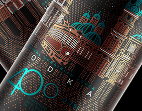
Packaging Content: Vodka
Location: Ukraine

This beautiful Vodka design has our eyes completely captivated. The illustration is what makes this Vodka packaging truly stunning. This bottle immediately grabs the attention of the recipient as a specially crafted work of art. Showing the famous night life and landmarks of Lviv (City in Ukraine), the color scheme while dark and premium but it still pops and is very visually appealing.

Read more

Jazz Nature

$
0
0

Creative Agency: Ladyssenyadora | Graphic Studio
Project Type: Produced, Commercial Work
Packaging Content: Wine
Location: Spain

The Jazz Nature label consists of 14 independently positioned piano keys (2 octaves). Jazz Nature is a cava with a lot of fun and swing!

Ladyssenyadora (Raimon Benach, Montse Raventós and Jordi Roca) is a graphic design studio created in 2007.

Read more

Lvoff

$
0
0


Creative Agency: DanCo Decor Company
Project Type: Produced, Commercial Work
Client: Lvoff
Location: Ukraine
Packaging Contents: Vodka
Packaging Materials: Glass

Our company continues to surprise and please the amateurs of upmarket drinks. The very design, as a powerful marketing tool, makes the visitor fix eyes on the new interesting object. Same as Louis Vuitton and Calvin Klein, who attract customers by unusual and extravagant design solutions, the modest decorators of glass, embodying the new project, try to make it bright and interesting, to emphasize its uniqueness and quality, delighting the eye by contemplation of external look of the bottle, and then securing the opinion by its inner content.

The new bottle «Lvoff» recalls a gentleman from Wall–Street, getting ready to the ball. Wearing an expensive suit, this gentleman unwittingly attracts the overall attention by a good sense of elegance and style, so typical for an educated and sophisticated person. So, having made the promenade facile, this "gentleman" gets to the shop shelve, where it stends out among other things due to its expensive suit.

To create the "dress-suit" of the bottle «Lvoff», Danko Decor company has used the modern technologies of applying elements of the decor, which allowed to turn the layout into reality. In particular, the method of applying the paint on the bottle (coating), printing method with the UV - curable inks and the hot stamping method were used. The skillful combination of these methods was instrumental in creation of an original design and emphasizing the premiality of the new vodka

Read more

Innovative Feminine Pads

$
0
0

Creative Agency: Seven Hills
Project Type: Produced, Commercial Work
Client: TO2M
Location: USA
Packaging Contents: Feminine Pads
Packaging Materials: Aluminium foil

The O2 Movement is a brand that introduces the whole new concept of of breathability - it's unique feature is the whole product range such as feminine pads, diapers, respirator masks actively release OXYGEN. It's a game changer and we wanted to emphasize that amazing benefit with the crisp eye-catching bold minimalistic yet elegant packaging.

Read more

Beard Grooming Kit USTRAA (Student Project)

$
0
0


Designers: Ashik k, Chetan Patil, Varun Rajan Thayyil
Project Type: Student Project
School: MIT Institute of Design
Course: Product Design
Location: Pune, India
Packaging Contents: Beard cosmetics
Packaging Substrate / Materials: Rexin, HDPE, PET bottles

USTRAA as a brand has transformed the male grooming experience in India within the last few years.

Our design brief was to develop a Unique Selling Point to boost the sales of the brand, against their competition. We developed a promotional 'No Shave November" Beard Grooming Starter Kit for guys who want to support the international campaign by growing their facial hair throughout the month.

The design was mainly aimed at making the forms more masculine and attractive to the target user. Market and user research helped us develop the package in a better manner, that was more acceptable to the target audience.

Our research showed that users considered the current bottle design to be more of a clinical form that was not very attractive to the current youth, who are a major part of the brand's customer group. Our approach was to redesign the form to make it a little more masculine and user friendly.

The bottles were being sold separately in tin containers. As beard grooming is still at a growing stage in our country, a novice potential customer is not really sure of the products he requires.

Hence, in support of the No Shave November campaign, we developed a complete starter kit that includes all essentials in one go.

Read more

Cocoro Rooster

$
0
0

Designer: Galilea Torres
Project Type: Produced, Commercial Work
Location: Guadalajara, México
Packaging Contents: Fast food, beverages
Packaging Substrate / Materials: Paper

Cocoro Rooster is a fast food restaurant that serves chicken-based meals with a dynamic and cheerful concept that entices both kids and adults with its fun branding design.

For the creation of this brand we used techniques such as illustration and 3-D modelling for the character and patterns, playing with colors, and created the lettering for the logo by using geometric patterns and freehand work.

Read more

Cute Frappy

$
0
0


Creative Agency: Lemon Yellow
Project Type: Produced, Commercial Work
Location: India
Packaging Contents: Snacks

The challenge was to create a fun and innovative design. It must have some personality and can be a leadership in the category. The packaging line is divided into 3 different flavors.

The packaging displays a cute little characters out of each one, building a persona and story, that helps to make this food more appealing to kids.

This particular new line of product targeted to kids, having fun and exciting advantage. Therefore, the packaging needed to speak their language – making it both fun and playful and tempting as a product.

Read more

Valkovskaya

$
0
0


Designers: Radmir Volk& Ksenia Valkovskaya
Project Type: Commercial Work
Packaging Materials: Paper, Cardboard
Printing Technique: Foil stamping, Digital printing
Location: Moscow, Russia

Ksenia Valkovskaya is an aspiring fashion designer from Saint Petersburg, Russia, graduated from the State Academy of Art and Design.

Read more

​My Care Solution​ (Concept)

$
0
0


Designer: ​Radmir Volk
Packaging Materials: Paper, Cardboard, Plastic
Printing Technique: Foil stamping, Digital printing
Location: Moscow, Russia

Read more

Fruto Noble · Bodegas Francisco Gómez

$
0
0


Creative Agency: Cabello x Mure
Project Type: Produced, Commercial Work
Client: Fruto Noble · Bodegas Francisco Gómez
Location: Spain
Packaging Contents: Wine

The concept line worked on the packaging of Fruto Noble is an elegant and sensual tribute to the love story between Bacchus (god of wine and fun, inspirer of madness, ritual and ecstasy) and Princess Ariadne (symbol of the soul and inspiration, the salvation that comes at the time of great adversity). The passion and love between them is represented through beautiful fragments of paintings that also reflect the eroticism and the pleasure of the forbidden. The harmony of the elements and the color makes the whole convey a classic and innovative aesthetic.

Read more

Almanac Beer Co.

$
0
0

Creative Agency: Chad Michael Studio
Project Type: Produced, Commercial Work
Client: Almanac Beer Co.
Packaging Content: Beer
Location: USA

A series of beautifully crafted, barrel aged beers by Almanac Beer Co. in San Francisco needed a equally gorgeous design that spoke to their aging process and rich ingredients.

Read more

Kahveland Coffee

$
0
0

Creative Agency: Kent Ajans
Creative Director: Hamit Duran
Project Type: Produced, Commercial Work
Client: Kahveland
Location: Turkey
Packaging Contents: Coffee
Packaging Substrate / Materials: Metal
Printing Process: Digital printing

kahveland Coffee started to process coffee in a small workshop. Their small workshop surrounded with nice smell of coffee. They are fascinated by its magic. As far as they knew it well, they explored many different aspects and produced with great excitement. In this way, they widened their product range. Eventually, they opened their factory in 2017 which their passion for coffee deserves. When we are tired of working, we give ourselves to coffee’s taste and smell. Coffee relaxes us, it accompanies us in a sweet conversation with a friend. kahveland Coffee is the name of the coffee which is soft and familiar.

Read more

Tayba Kitchen

$
0
0

Creative Agency: designojo
Project Type: Produced, Commercial Work
Client: Tayba Mediterranean Kitchen
Location: Rochelle Park, NJ
Packaging Contents: Food
Packaging Substrate / Materials: Plastic
Printing Process: Lithography

Tayba Kitchen is a New Jersey based food start-up with a focus on middle eastern cuisine. Tayba's initial product launch included a range of flavored hummuses: a classic hummus, a roasted red pepper hummus and an avocado hummus as well as a fresh falafel dough. The project involved the development of the Tayba logo, related brand assets and the packaging of their hummus and falafel products.

Read more

Marblate (Student Project)

$
0
0


Designer: Dana Dariel
Project Type: Student Project
School: Shenkar
Guidance: Tamar Many
Location: Sde Warburg, Israel
Packaging Contents: Chocolate
Packaging Substrate / Materials: Plastic, cardboard
Printing Process: illustration editing, digital printing, laser cut, stickers printing

MARBLATE is a package of brightly colored cup wrapped in a flexible sleeve. The sleeve can be removed, deployed along its length, and hung on the wall. Each sleeve contains 12 chocolate cubes of quality marble.

Instructions: Take one or two chocolate cubes, put it in the cup, add pour hot milk and just MARBLE it!
 The chocolate will melt and you will have awesome hot chocolate.

There is two different flavors - Milk Chocolate and Dark Chocolate.

Read more

Almazera

$
0
0


Creative Agency: Iglöo
Art Director / Designer: Paola Coiduras
Creative Director: Eric Novo
Photographer: Paola Coiduras
Project Type: Produced, Commercial Work
Client: Almazera
Location: Huesca, Spain
Packaging Contents: Snacks
Packaging Substrate / Materials: Cardboard
Printing Process: Offset printing

These quality almonds deserved a packaging to its level and besides its origin is the Aragon pre-Pyrenees (Spain), so there was something better than a mountain-shaped container to sell them?

Our brief was to develop a brand and packaging for Almazera's gourmet range of almonds. Our client wanted something special to be fast recognized on the shelves of the market, in store retailers, etc. Firstly we create a packaging shape of mountain to stand out compared to the rest of competitors and then we created a warm range of color to distinguish the different range of flavors.

Read more

wholefood.me

$
0
0


Agency: Jam&Co Design
Project Type: Commercial Work
Client: wholefood.me
Location: Sydney, Australia
Packaging Contents: wholefood snacks: nut butters, health bars, trail mixes, nut mixes
Packaging Substrate: 100% recycled cardboard
Printing Process: Flexography

Wholefood.Me is a weekly subscription snack box centred around the beauty of eating Wholefood. The company founders sought to bring a product to market that provides busy individuals with convenient, healthy, nourishing and tasty snacks.

Jam&Co took them on a branding journey, establishing the functional & emotional brand drivers as well as the brand personality. The greatest challenge and key to success was showcasing the authentic naturalness of the brand in an environment where everyone screams ‘natural’, so it was crucial to understand the foundations of what they stood for and what would drive purchase.

The subsequent brand is one that creates an emotional connection with the audience by tapping into the feeling of ‘guilt free’ pleasure you have when eating these snacks. From the satisfied smile to the personalised greeting on the box each element was designed to bring a little smile of satisfaction to your face.

Outside of branding the next critical step was understanding the consumer journey online. Being a subscription service we needed to clearly show what the product was, how it worked and encourage people to sign up without discrediting the genuine authenticity and honesty that really set this brand apart from their competitors. We did this through the use of colloquial language, emotive imagery and creating a seamless process for users.

The whole thing creates a truly personalised and enjoyable experience for subscribers. We want them to feel good about nourishing their body.

Read more

Korzen

$
0
0


Creative Agency: MamboMambo
Project Type: Produced, Commercial Work
Client: Korzen
Location: Québec, Canada
Packaging Contents: Kombucha
Packaging Substrate / Materials: Glass bottle / Paper
Printing Process: Digital printing

Composed of carefully selected teas as well as plants and fruits from the farm, Korzen kombuchas are as healthy as tasty. Made in a traditional way at the Bio Ferme des Caps, near the Charlevoix region, this range of products expresses the values and the terroir of this region. We've been mandated to develop Korzen's global identity as well as all the illustrations for each of the brand's flavors.

Read more

The Humble Co Natural Toothpaste

$
0
0


Designer: Evelina Ginzburga
Project Type: Produced, Commercial Work
Client: The Humble Co.
Photos: The Humble Co.
Location: Riga, Latvia
Packaging Contents: Natural Toothpaste
Packaging Substrate / Materials: Plastic Tube

This toothpaste from The Humble Co. is brought to you by dentists who care about your oral health, our environment and children in need of oral care. It is promoted as the eco-friendly, vegan and modern alternative to standard toothpaste.

What's Unique?
Packed using Albéa Greenleaf® patented technology with reduced environmental impact.

Read more

Masquerade Cheese (Concept)

$
0
0
<


Creative Agency: Ural Branding Company
Project Type: Concept
Location: Russia, Ekaterinburg
Packaging Contents: Cheese
Packaging Substrate / Materials: Plastic Container

Branding agency Ural Branding Company has developed a conceptual packaging design for Italian cheeses called "Masquerade".

Venetian masks are one of the priceless cultural phenomena - Venetian carnival masks - the most famous and oldest, most original and unexpected: here the realm of masks and life itself resembles a theatrical stage among the canals. Dances in the squares, luxurious embroidered with gold and decorated with precious stones carnival costumes.

A mask means to be unrecognized. At the Venice Carnival the masks were mandatory, and the traditional carnival masks in Venice are divided into two groups: Del Mate comedy masks, and classic masks. Not surprisingly, in the XV century there was a whole profession of mask crafter.

The concept was based on the famous Venetian masquerades, which demonstrate luxury and traditions of Italy. This idea (Venecian mask) was visualized on the front package for cheese and a gift set, which consists of three flavors.

Such a bold decision in bright combinations and images will bring new visual perceptions to the traditional design of classic Italian cheese.

Read more

648°

$
0
0

Creative Agency: OTVETDESIGN
Project Type: Produced, Commercial Work
Location: St.Petersburg, Russia
Packaging Contents: Golden brown baked chicken

Product
Golden brown baked chicken in vacuum pack.

Brief
Brand and packaging design development for baked chicken.

Problem
Conceptually new product in the market with no analogs available in Russia. As healthy as a boiled one; as tasty as a roasted one and as golden as a grilled one - this chicken should have created a new niche. The main problem was, indeed, the strength of the product – its unique nature. Packaging on its own should have come up with specifics and benefits of the product as the budget did not cover any additional communication.

Tasks
Clearly and intelligibly transmit an idea of the unique cooking technology. At first chicken is baked in its own juice and then is put into infrared high-temperature behavior tunnel – this provides golden brown. Tune away of the mass-market grilled chicken – it has way too negative image of down-market good.

Read more
Viewing all 23894 articles
Browse latest View live